CHARLES MATSON
DESIGN

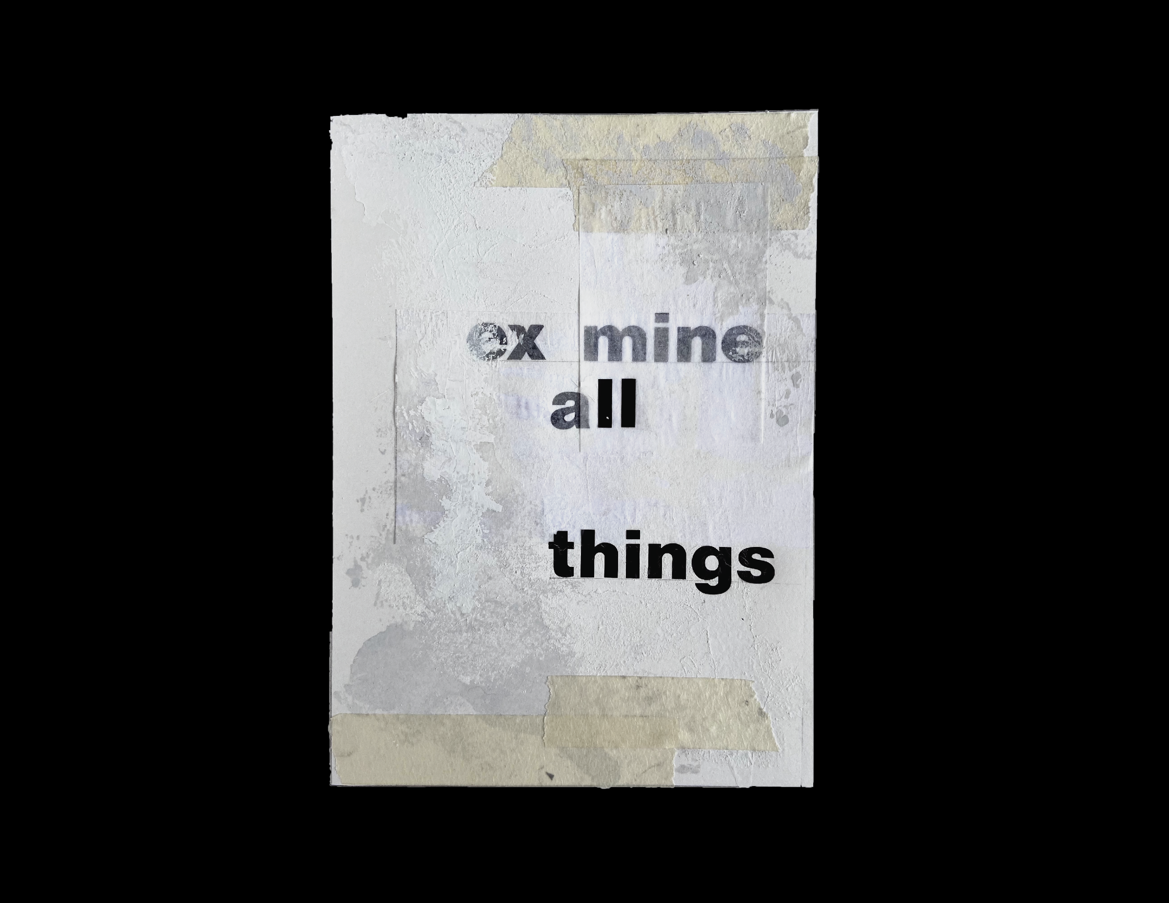


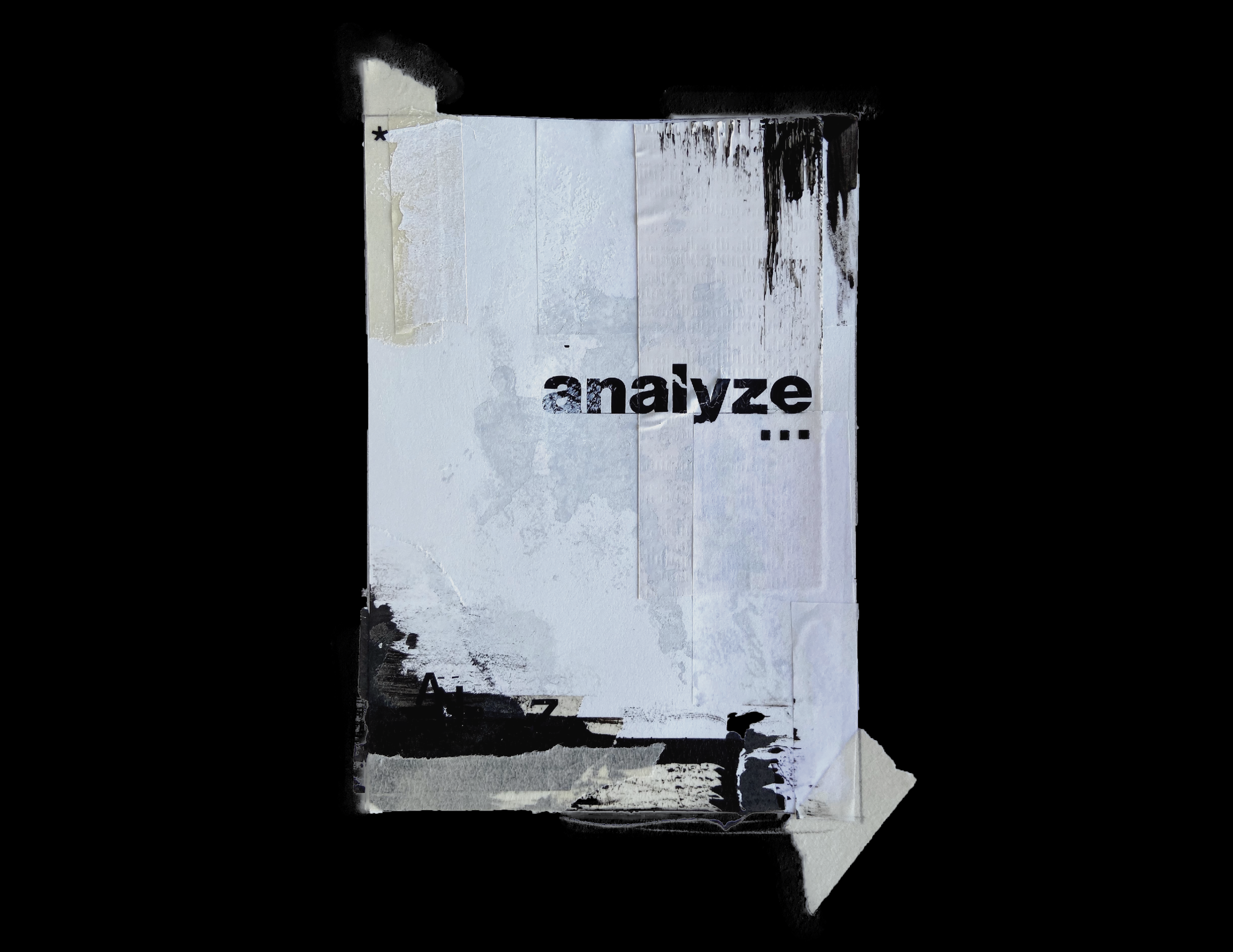
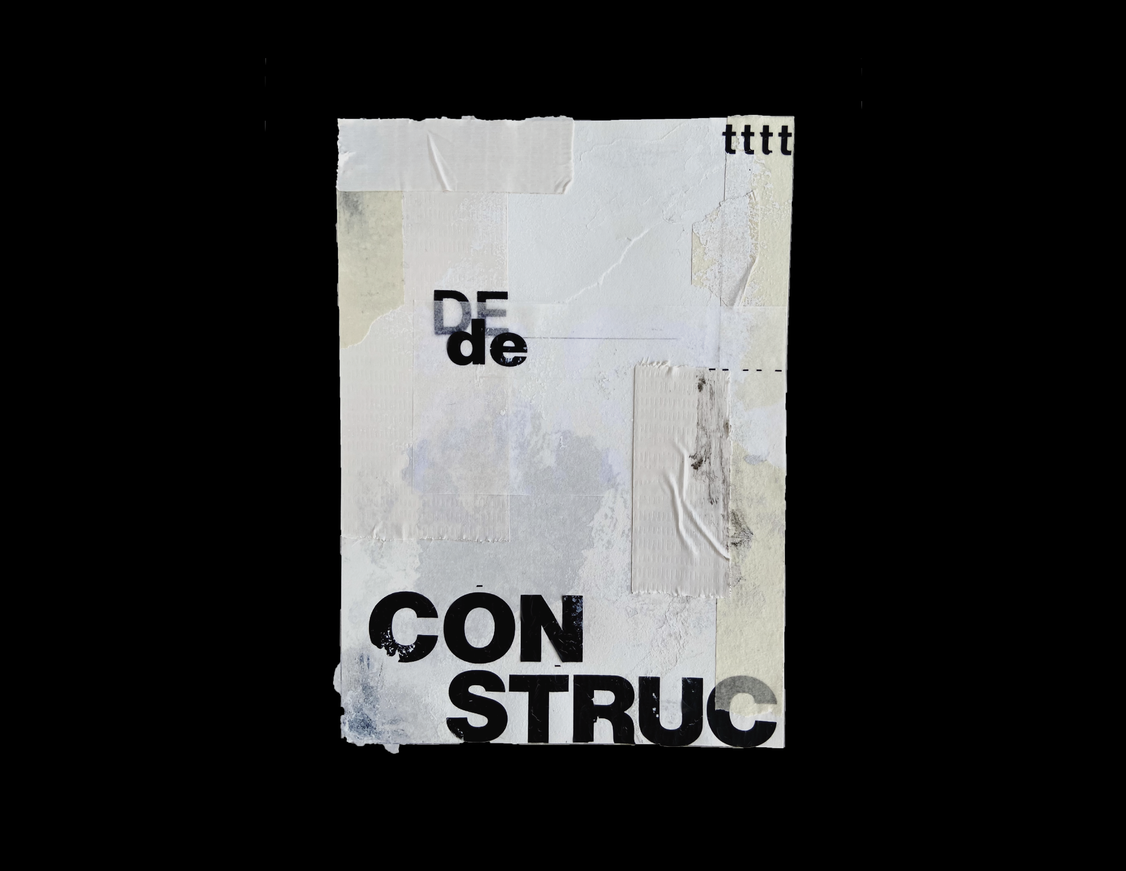
Work: Analog Design with Typography
Date: 2022
Details: I wanted to focus on the theme of “deconstruction” and strey away from digital design for a project. Throughout the past couple years, everything has been done digitally and we have had an absence of physical touch and using our hands. These pieces were made entirely by hand. In my work I love to combine analog and digital design to create something that is clean but with a bit of messiness and for this I wanted it to be a little more messy.
Materials: Letraset, tape, glue, white out, ink, paper
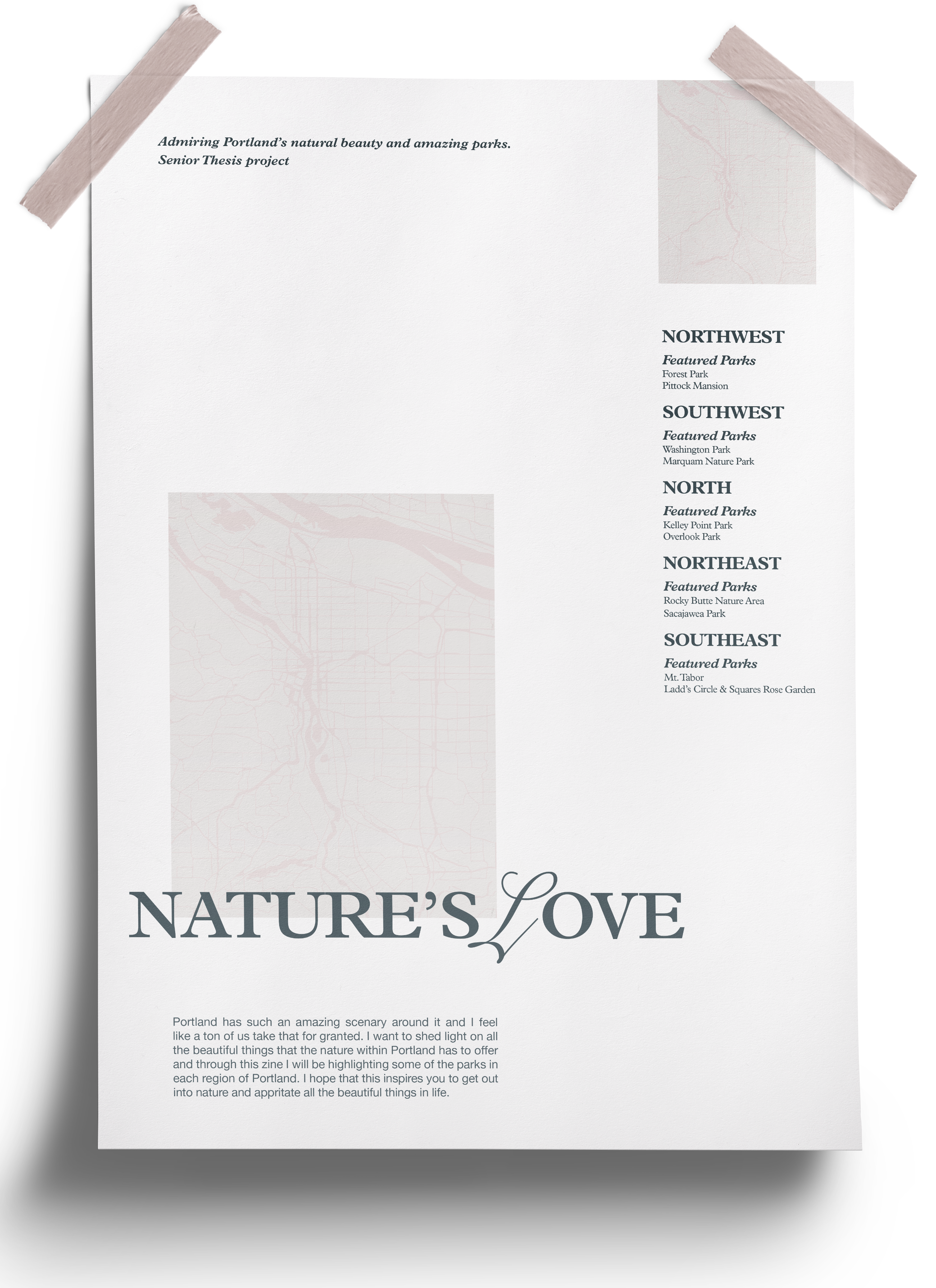
Work: Typography and Page Layout
Date: 2022
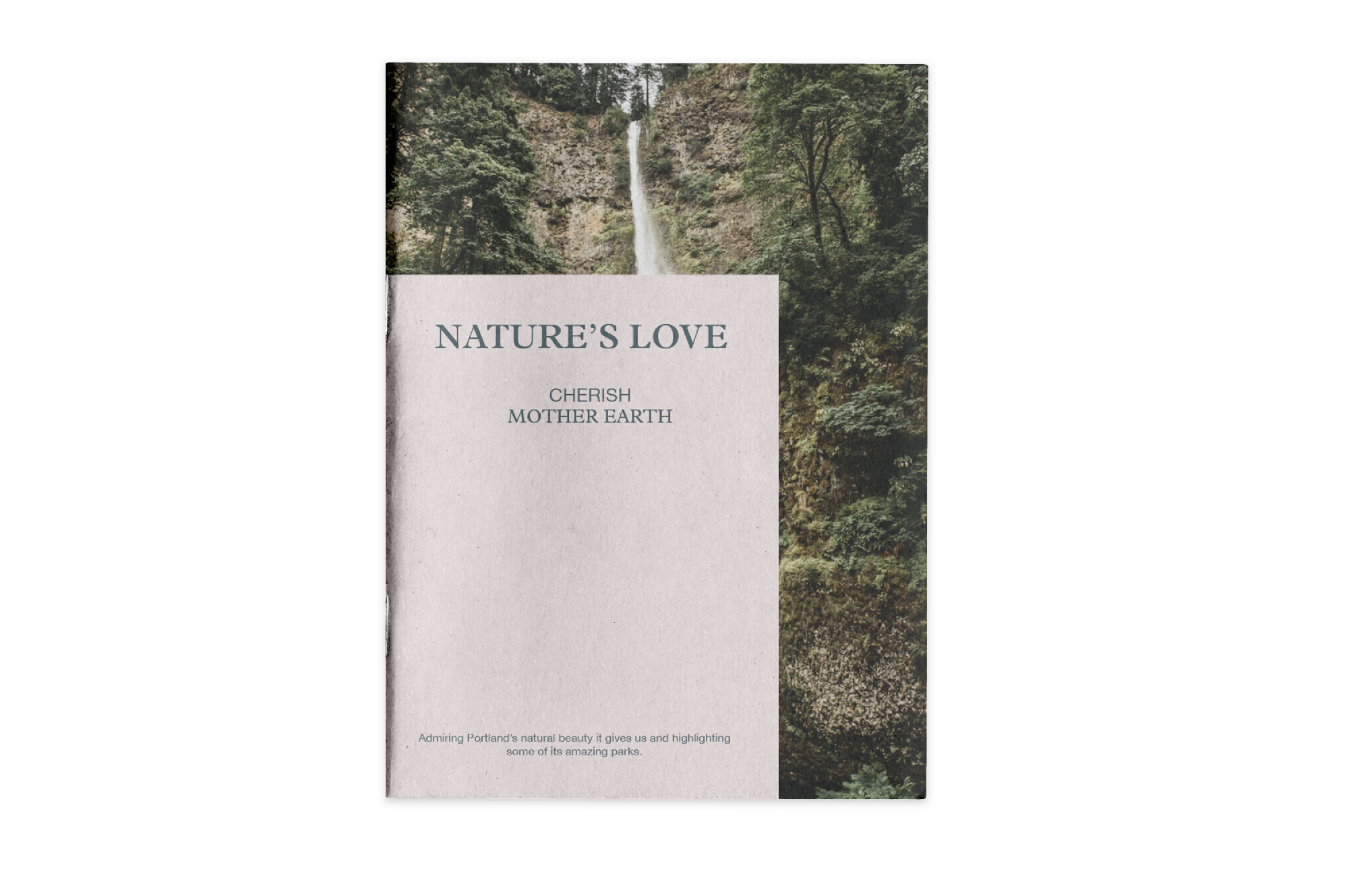
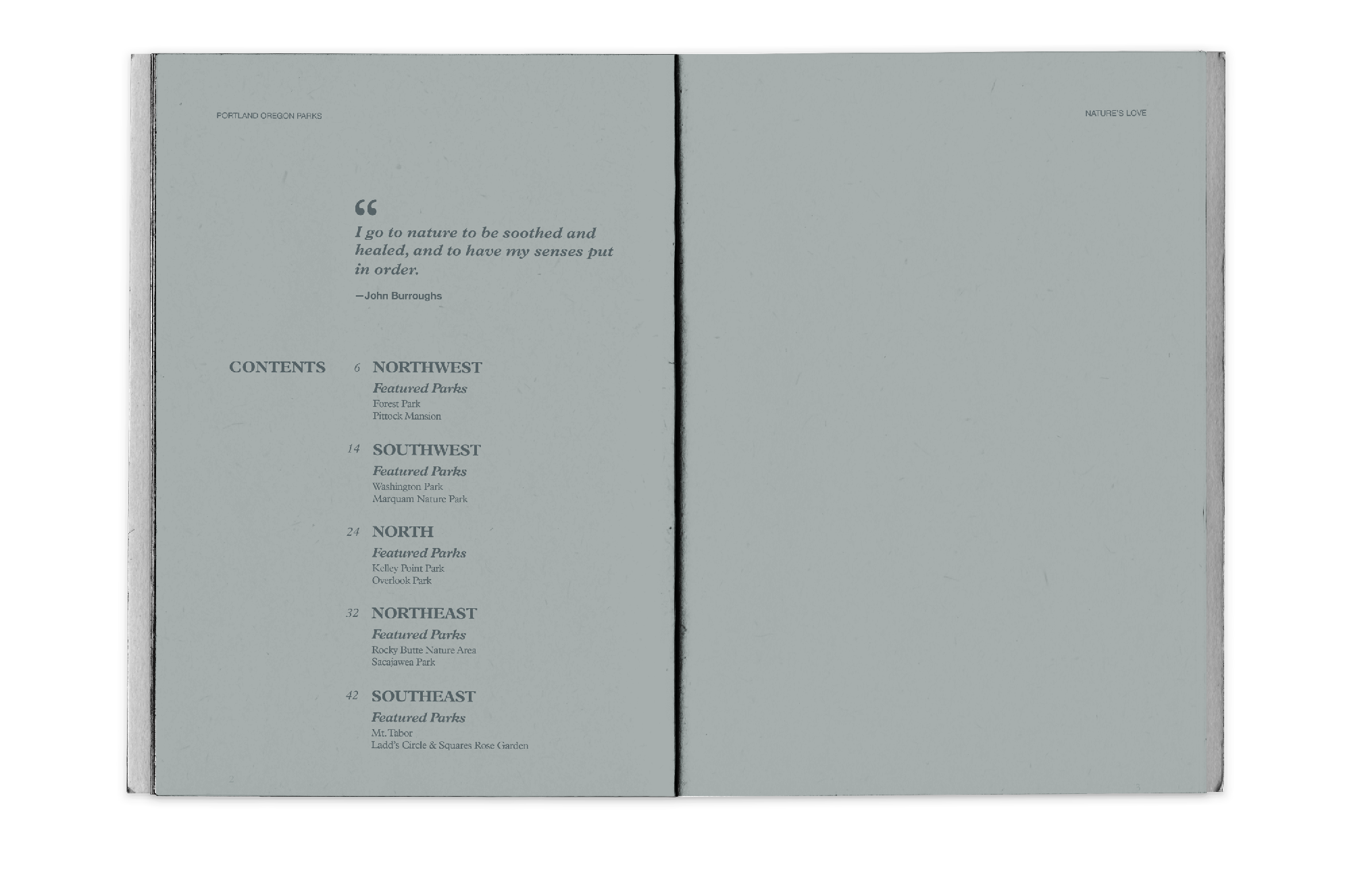
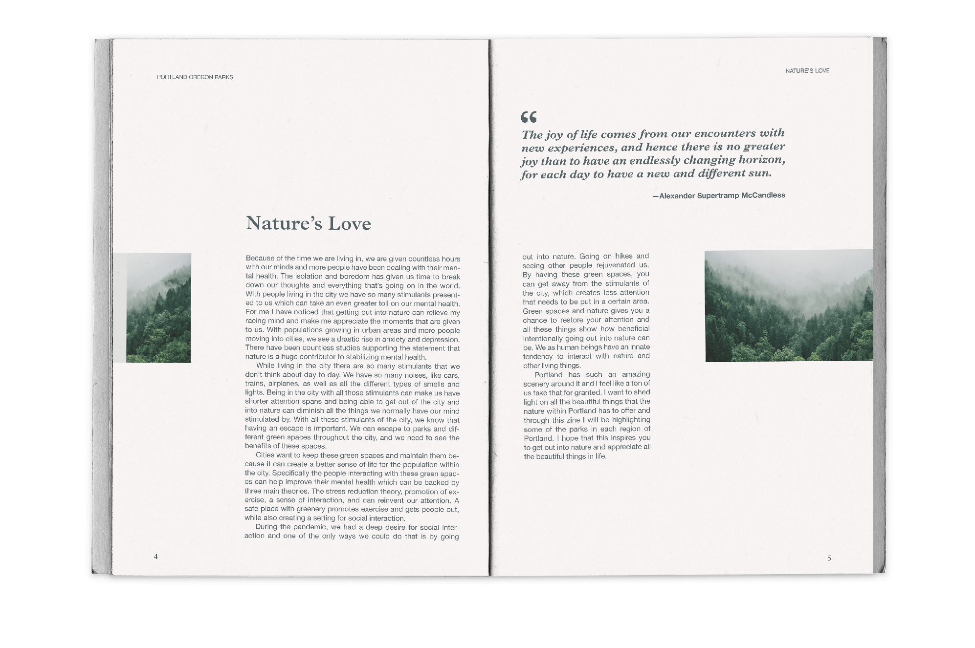
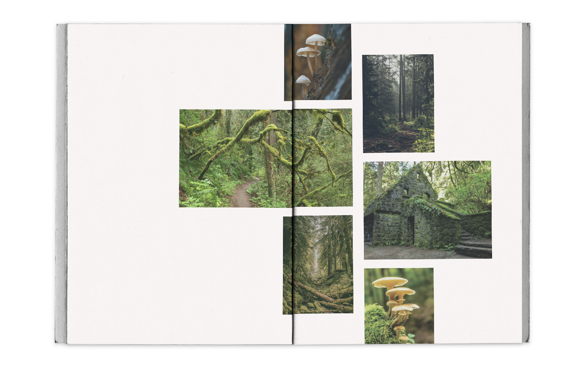
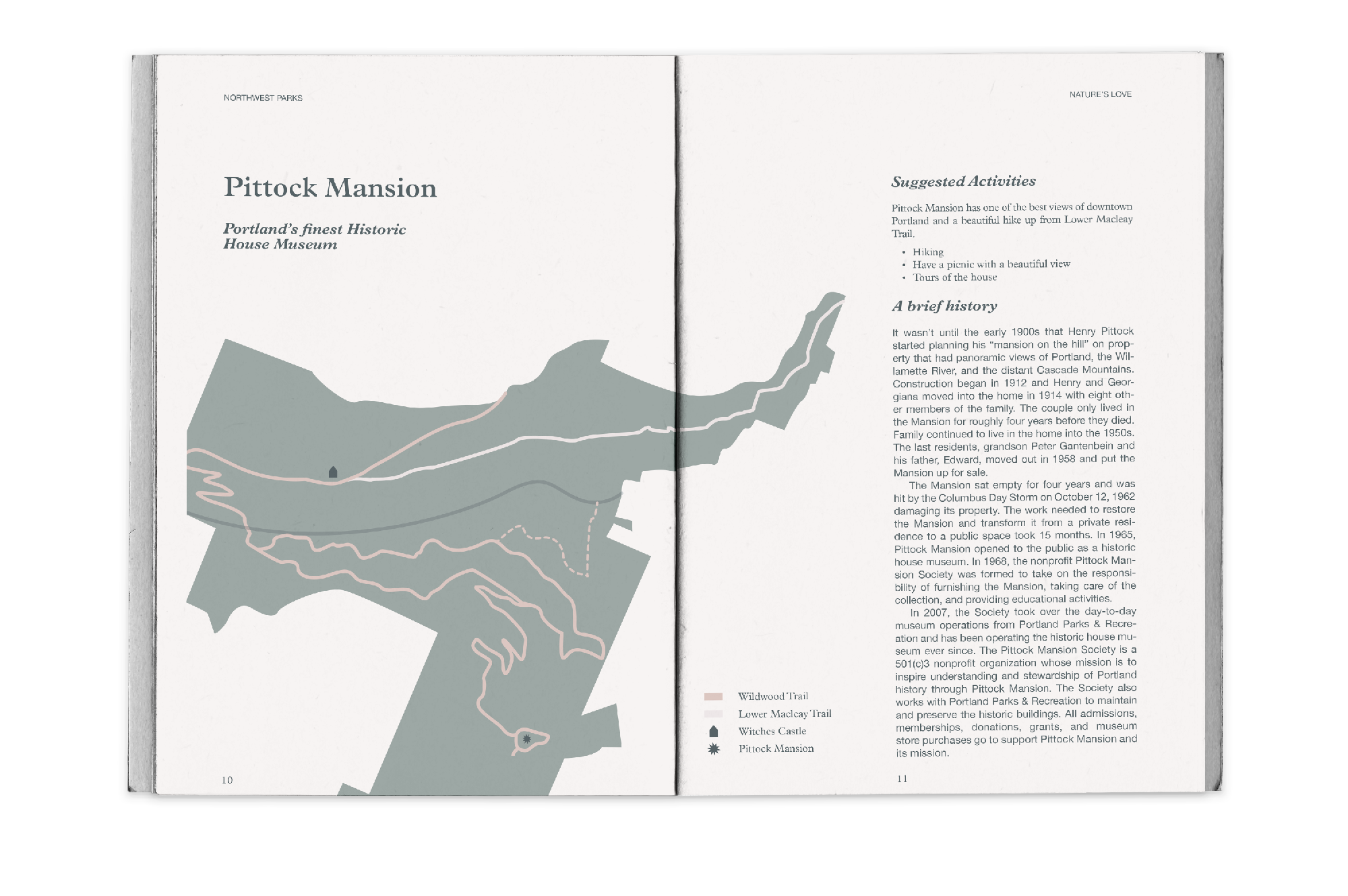
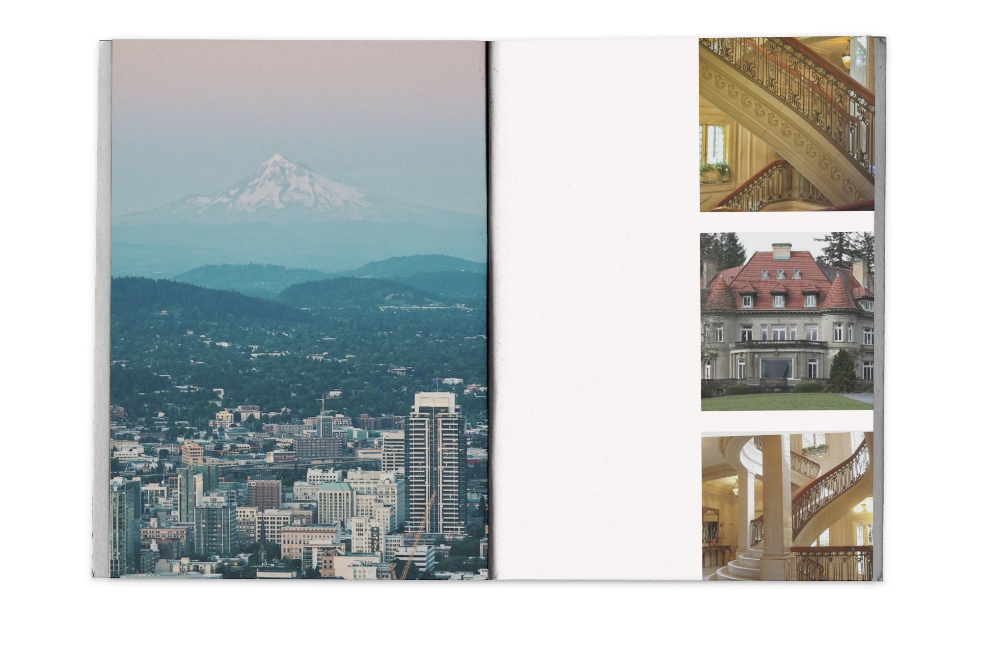
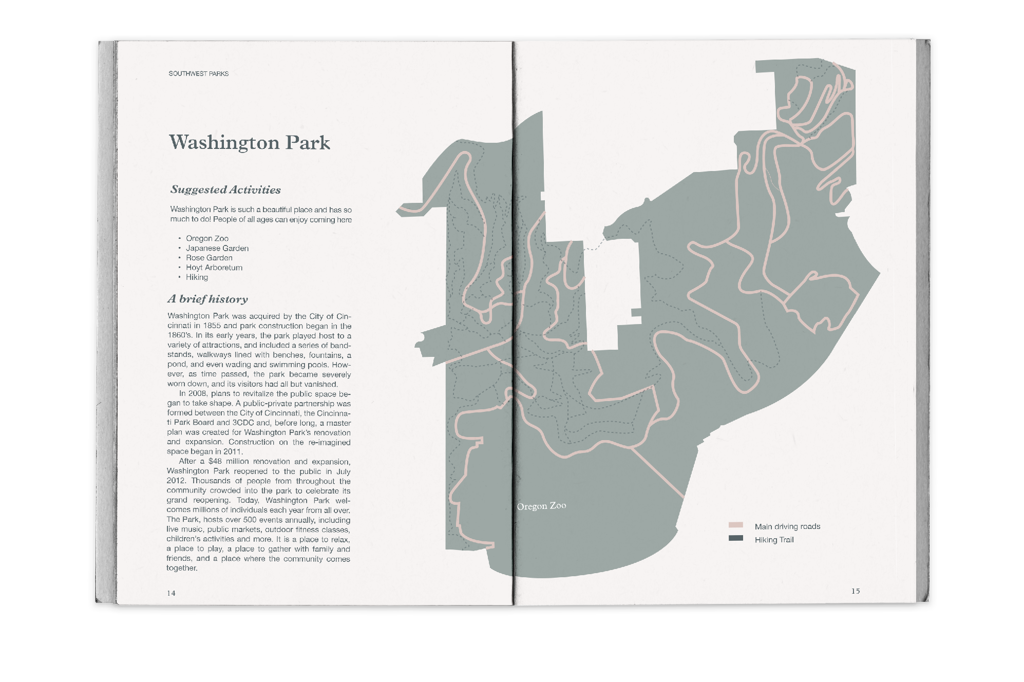
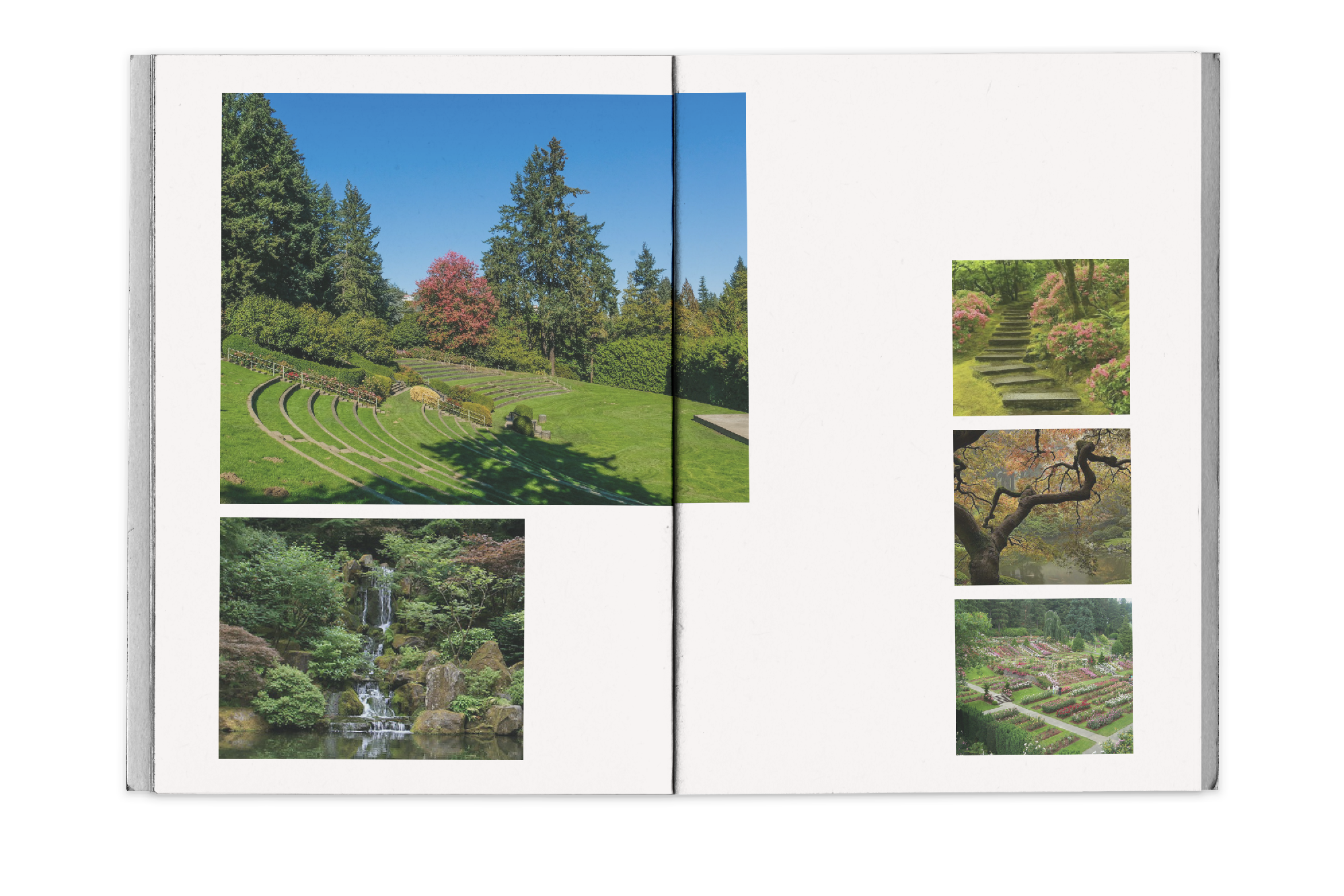
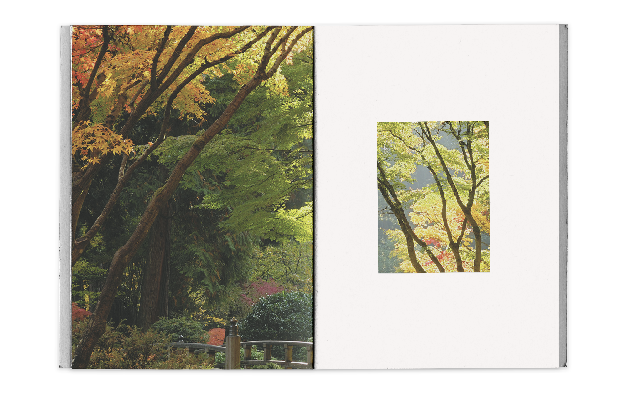
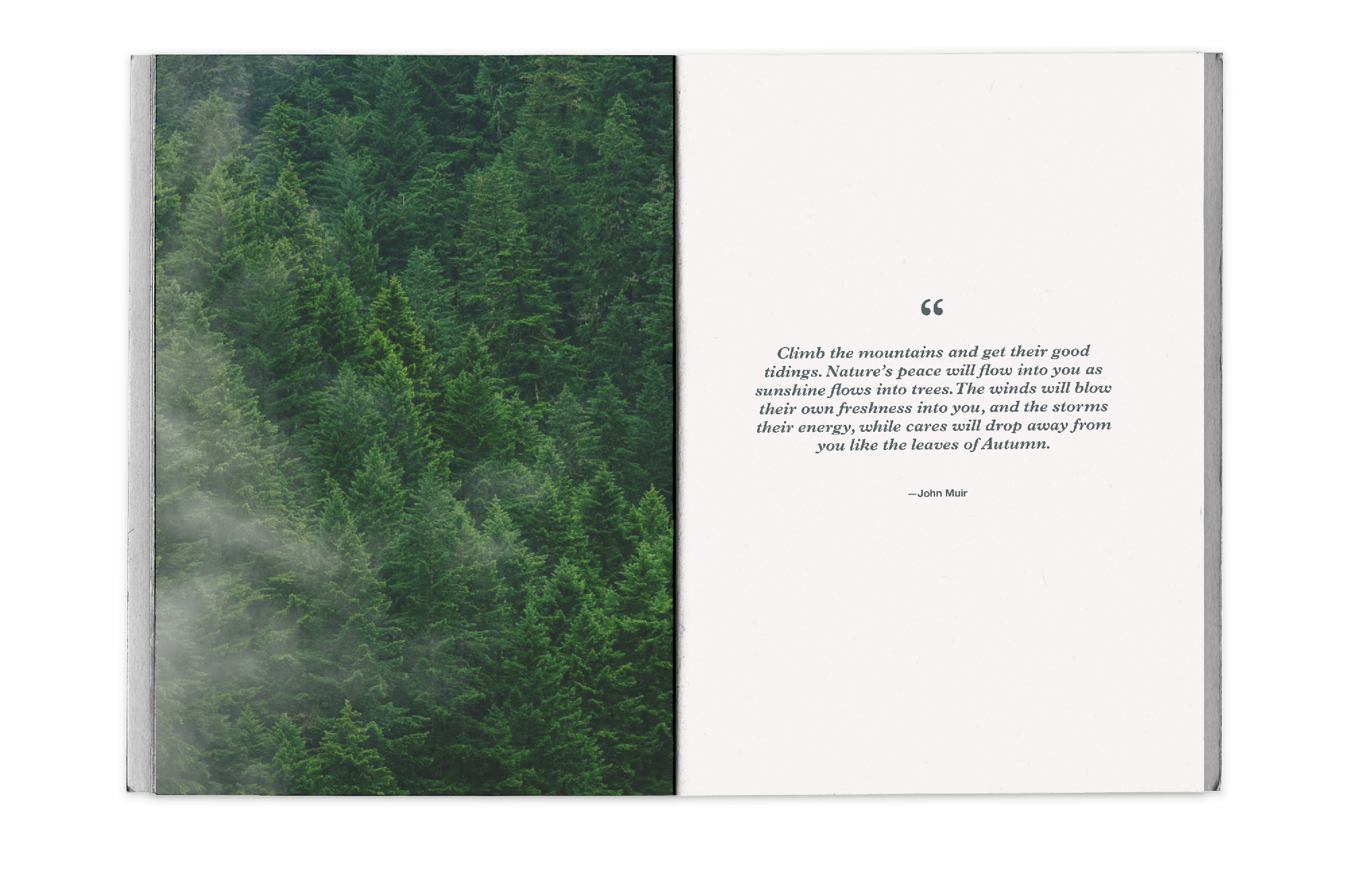
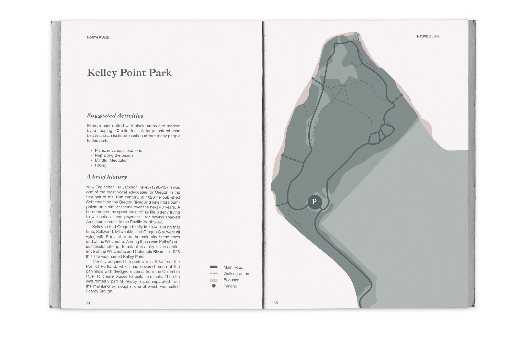
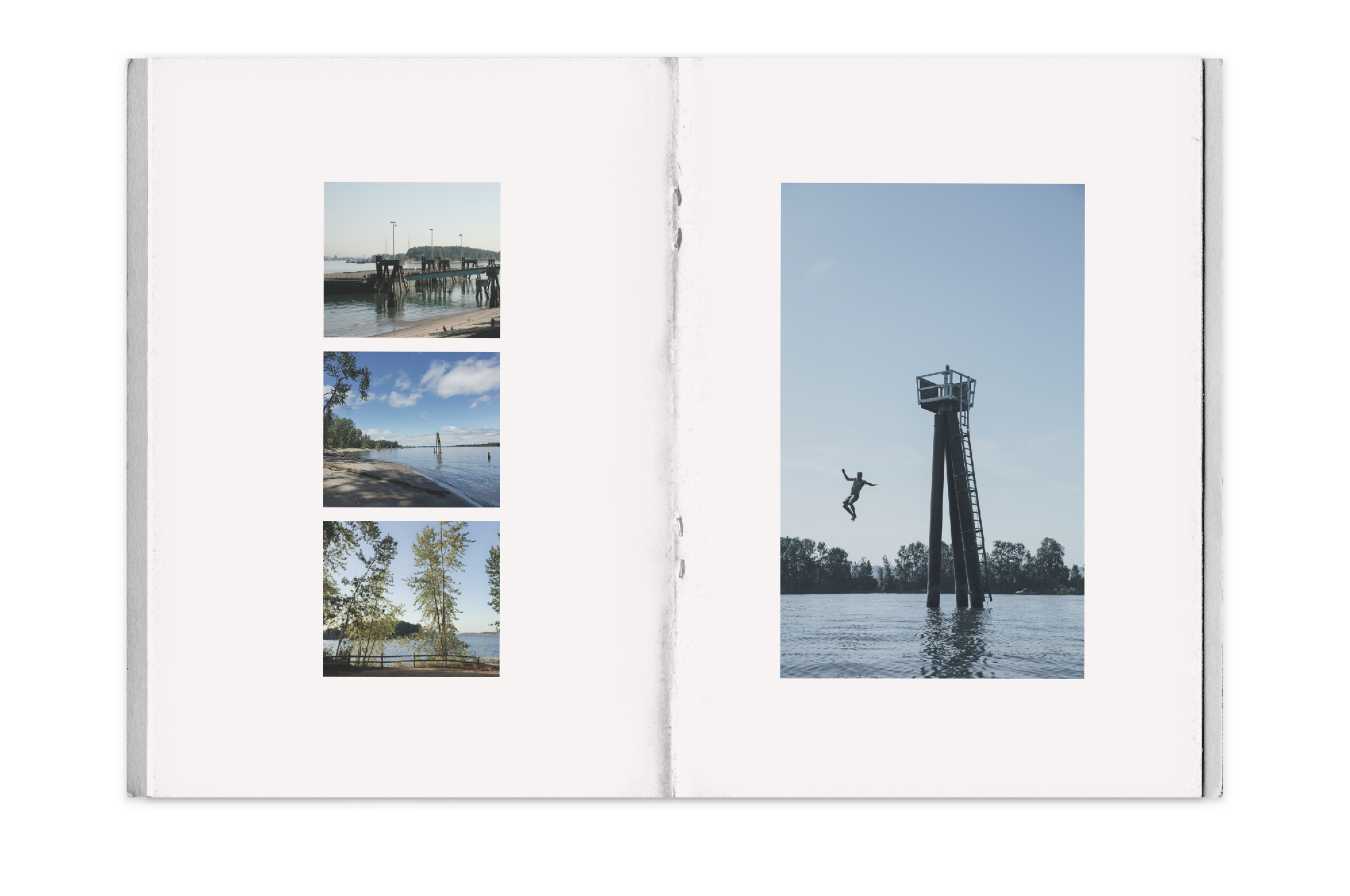
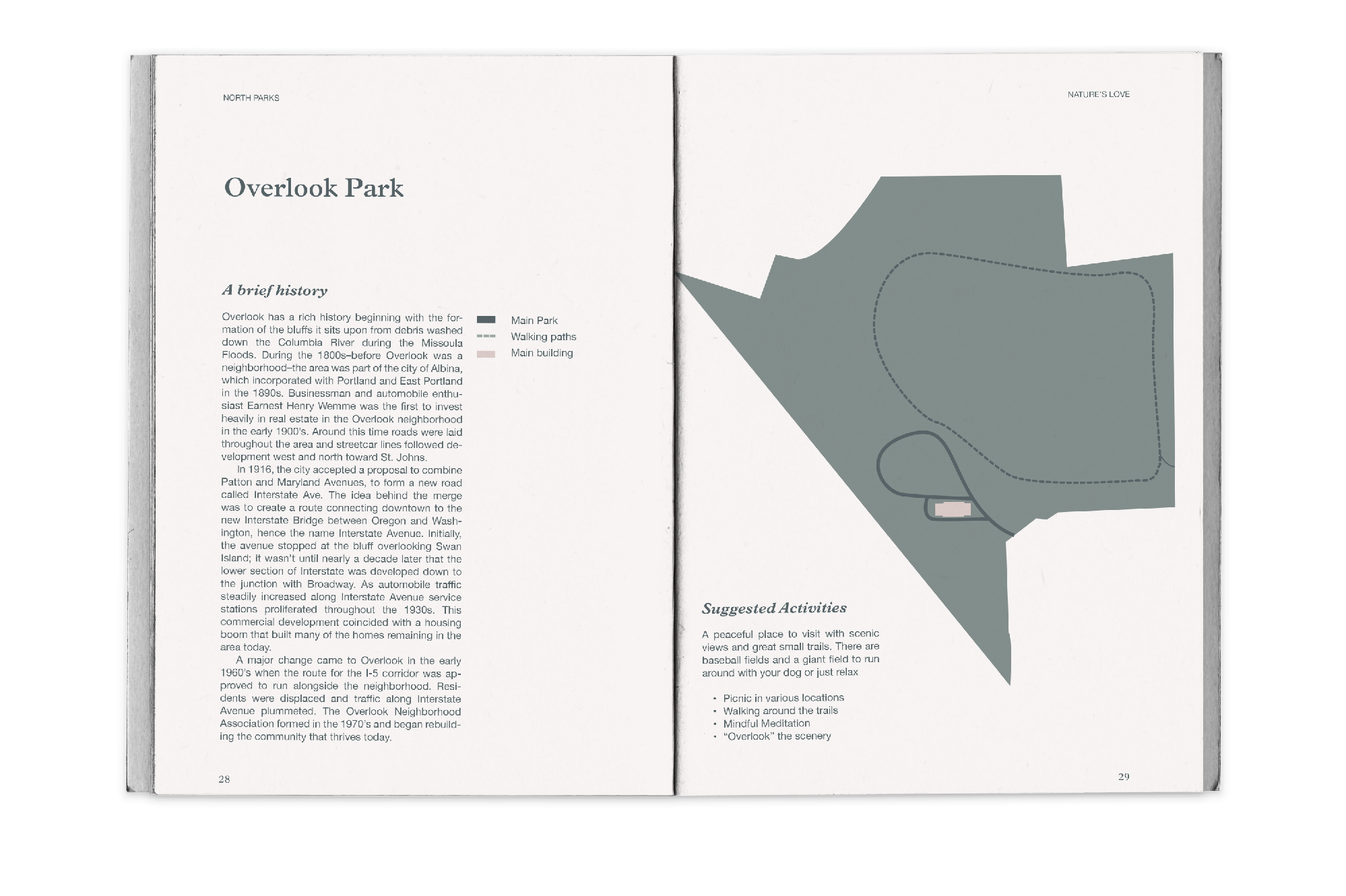
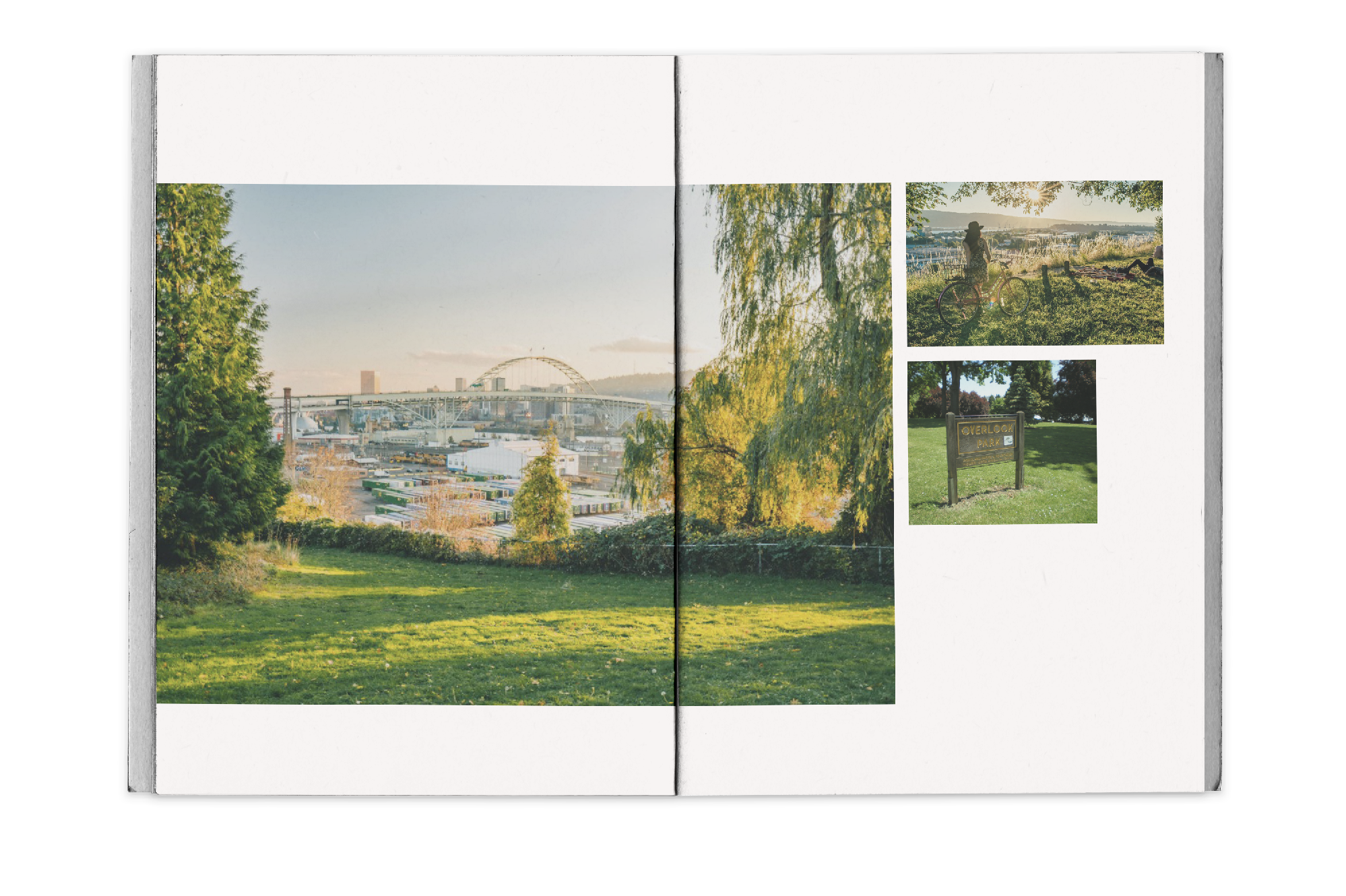
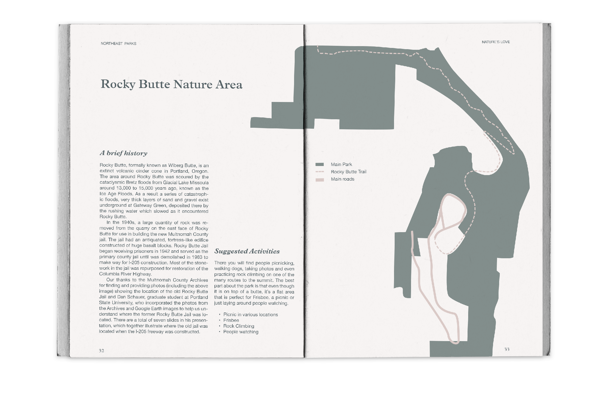
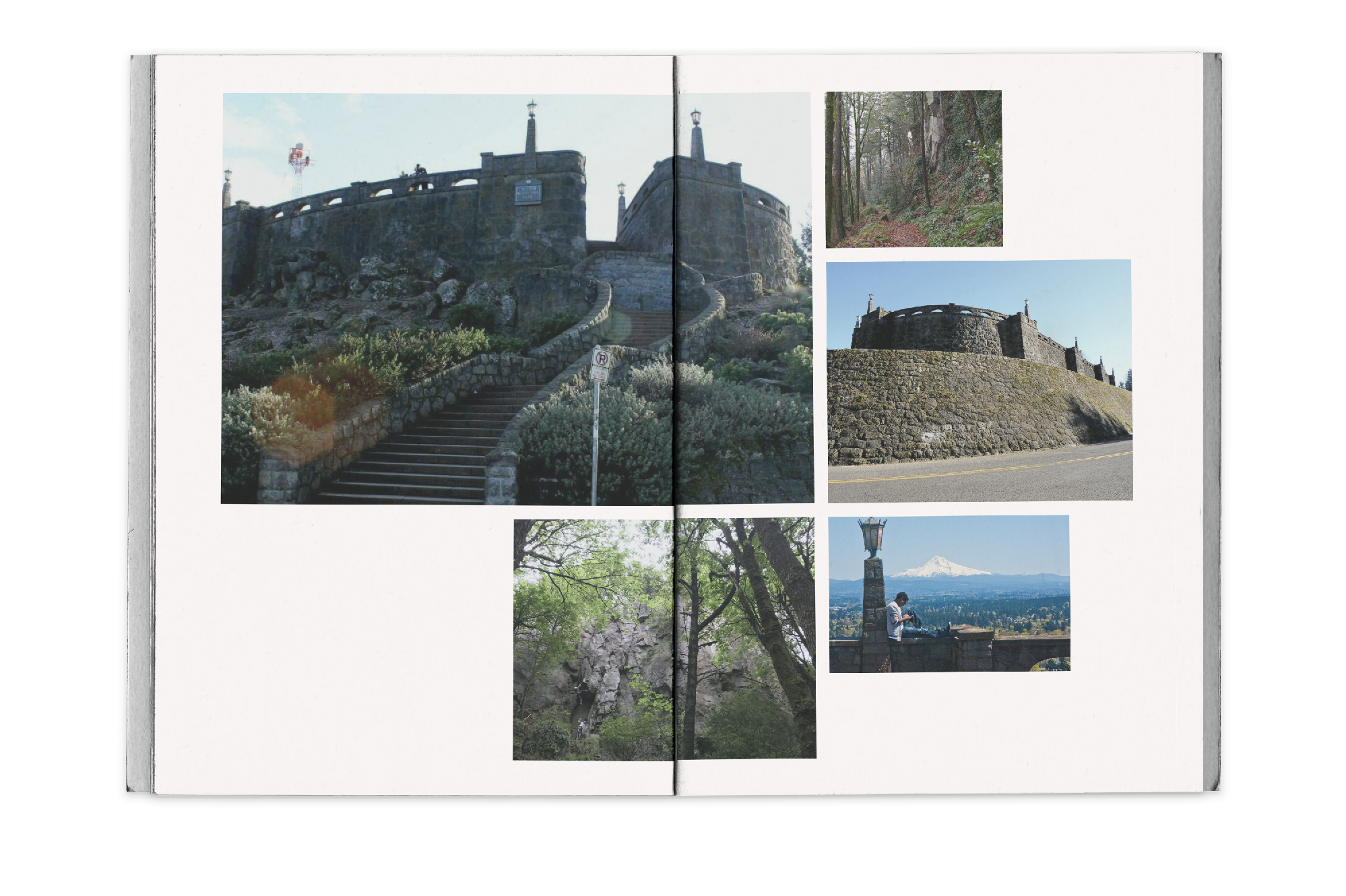
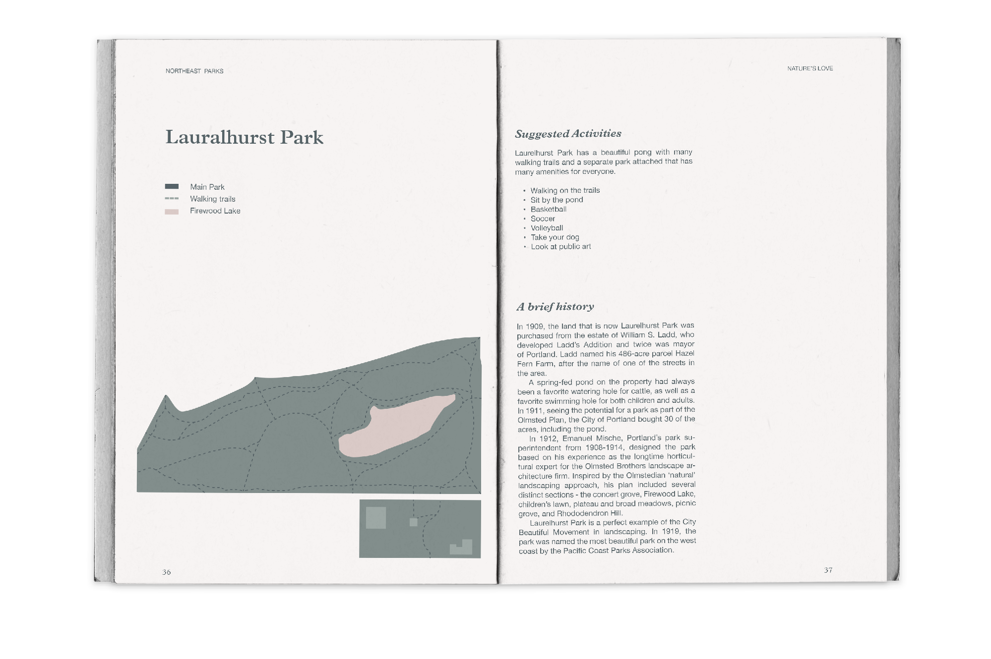
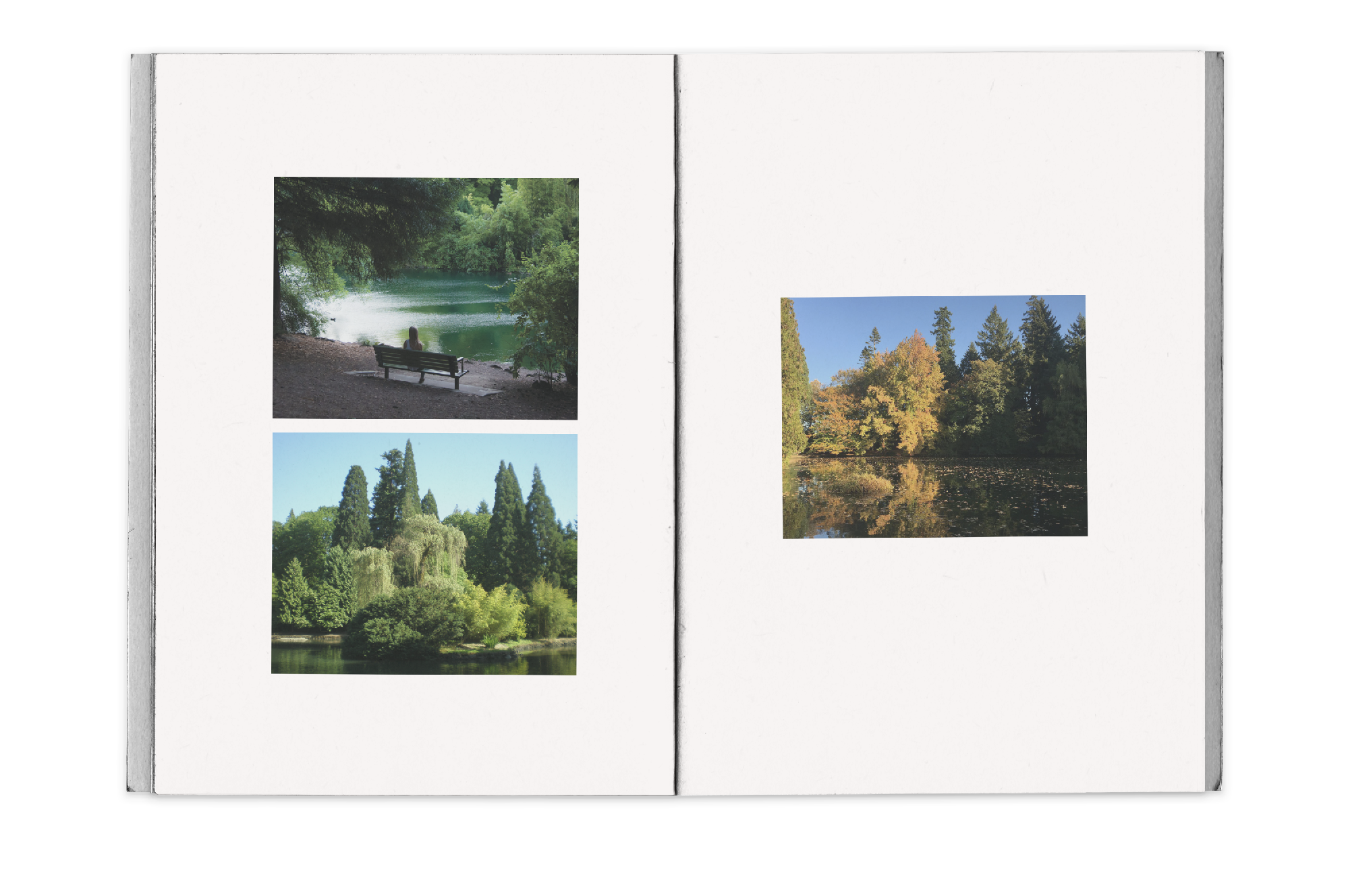
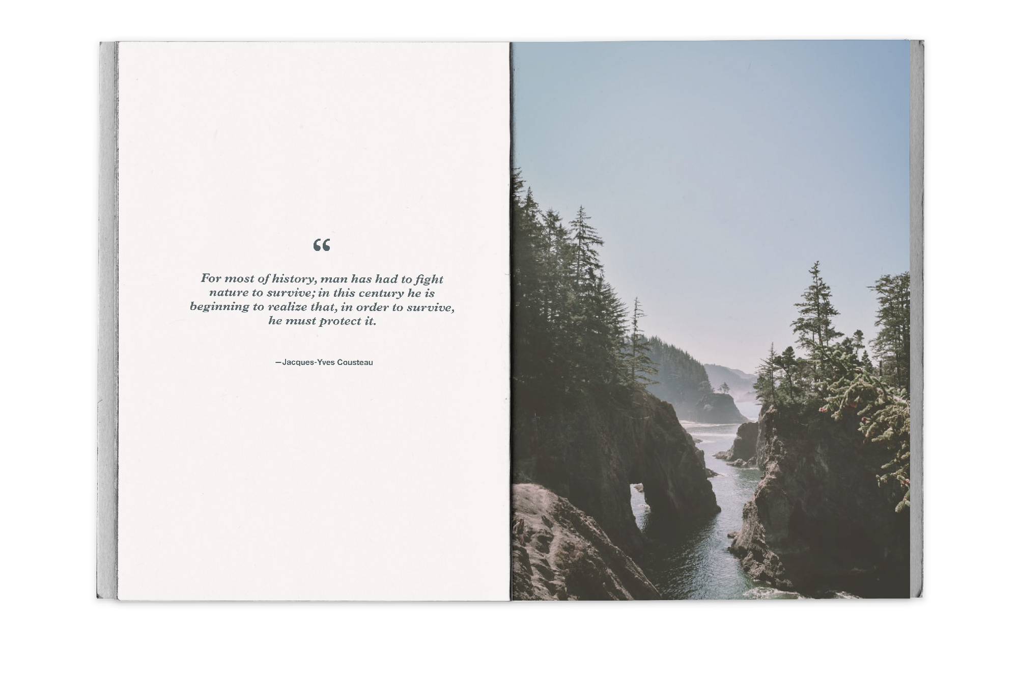
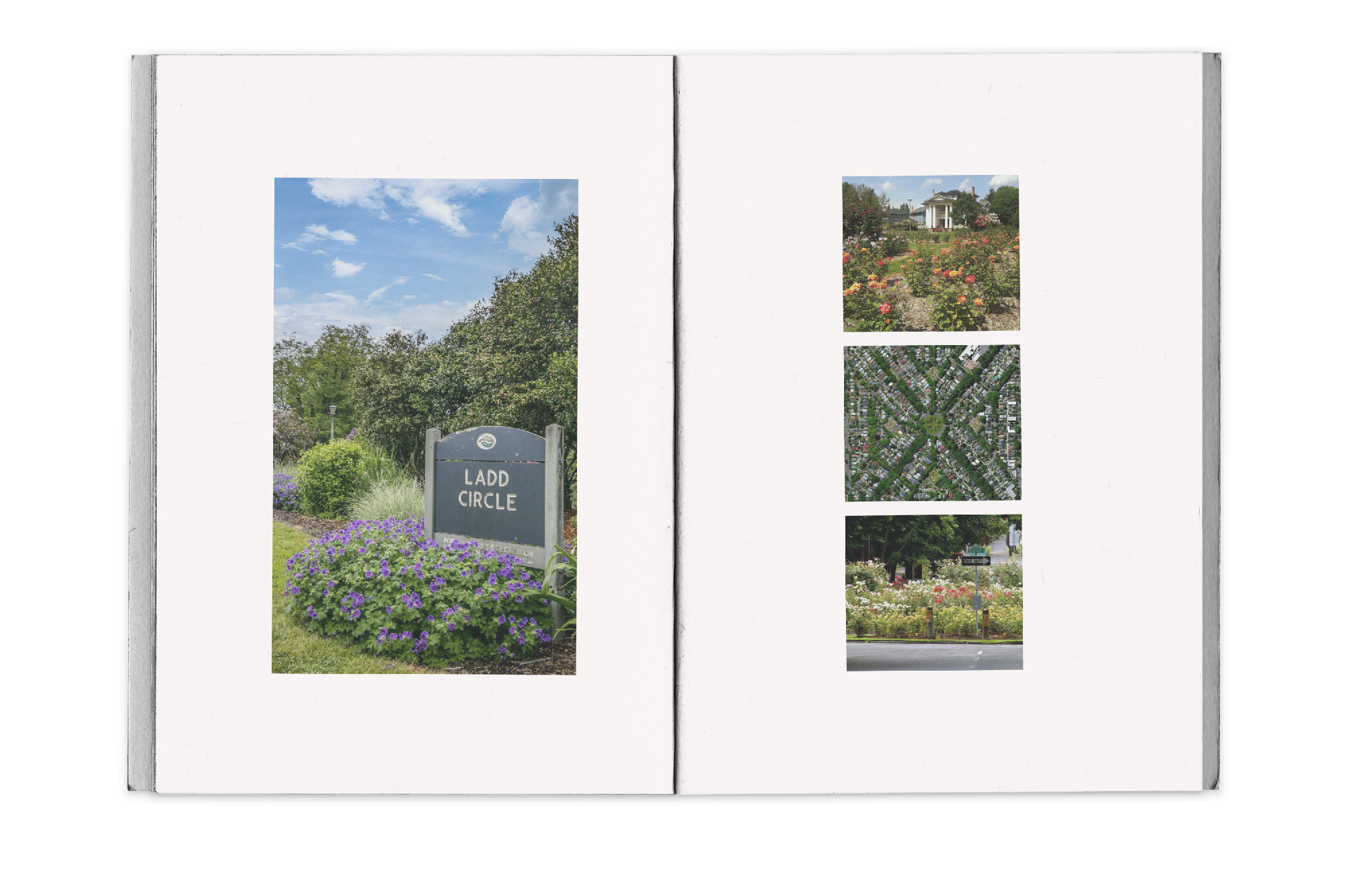
Details: Nature’s Love was my senior thesis project focusing on the benefits of intentionally going into nature and Its effect on mental health.
Mental health within cities has been a problem that needs more recognition. It's hard to promote good mental health in cities that don’t have a ton of nature throughout. There are so many stimulants in a city which takes away from appreciating nature and causes more anxiety and stress in everyone. Nature has been proven to be a huge contributor in stabilizing mental health, so I will be focusing on how nature can actually help people's mental health while living in the city.
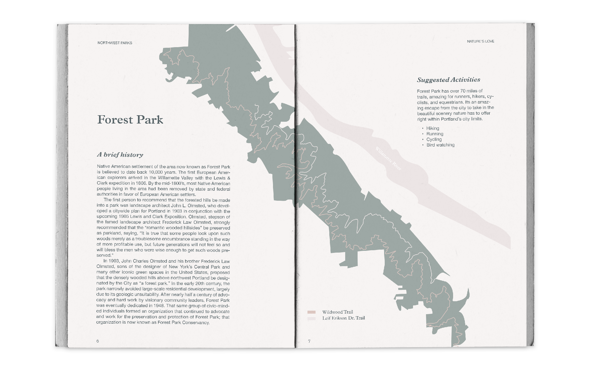
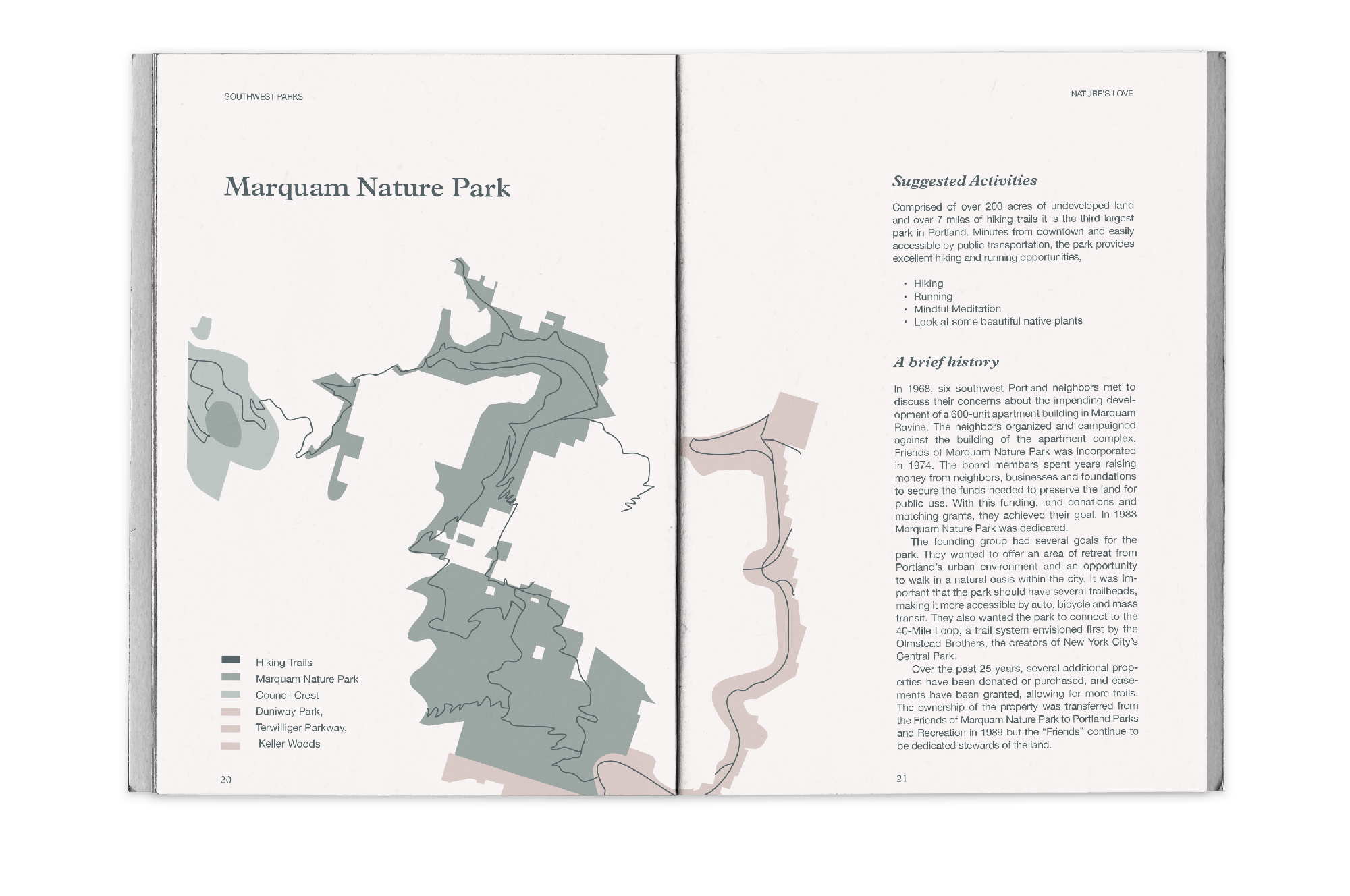
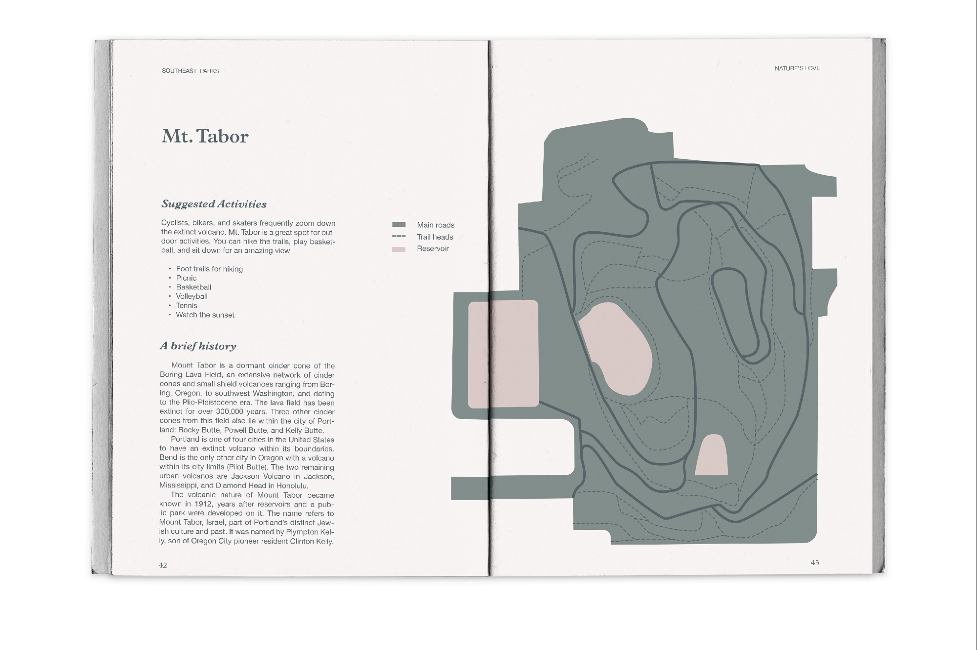
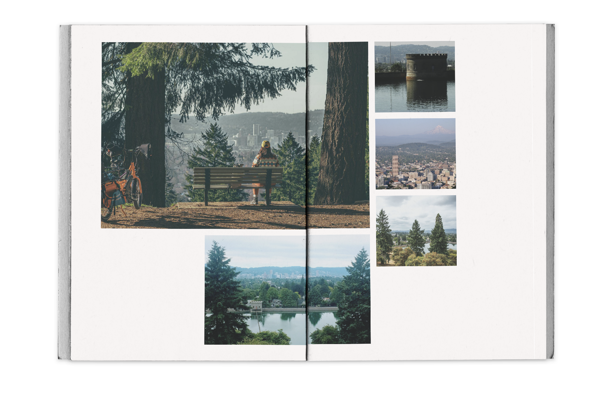
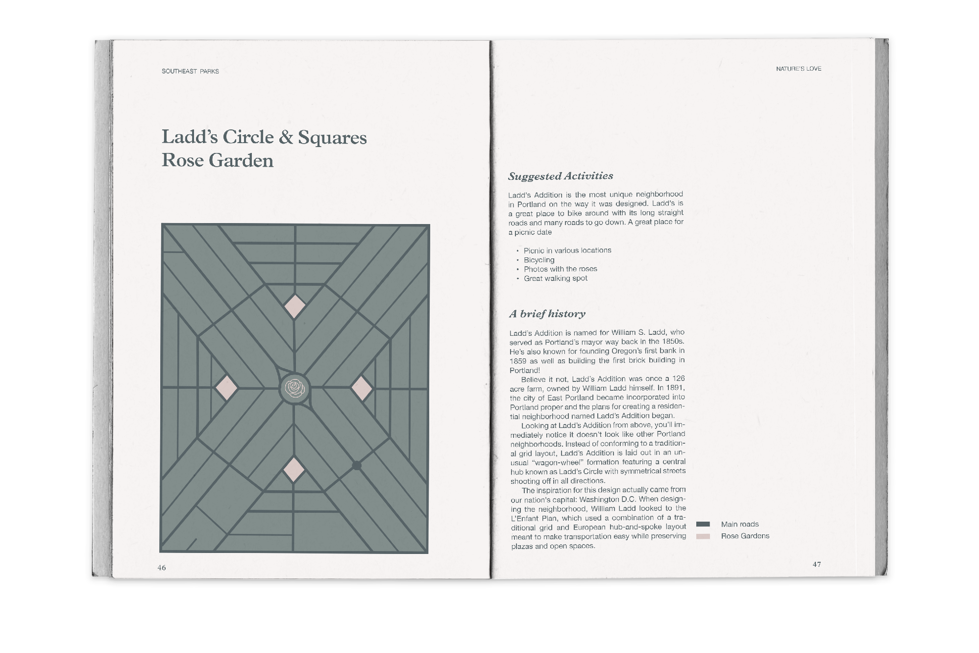
I created a narrative, map-based zine that will shed light on people's mental health within cities and how beneficial nature can be. Making a map based zine of all the green spaces within Portland will help some of these people stuck in a rut and show them all the lovely places they can escape within the city. I focused on two parks from each region of Portland to highlight them.
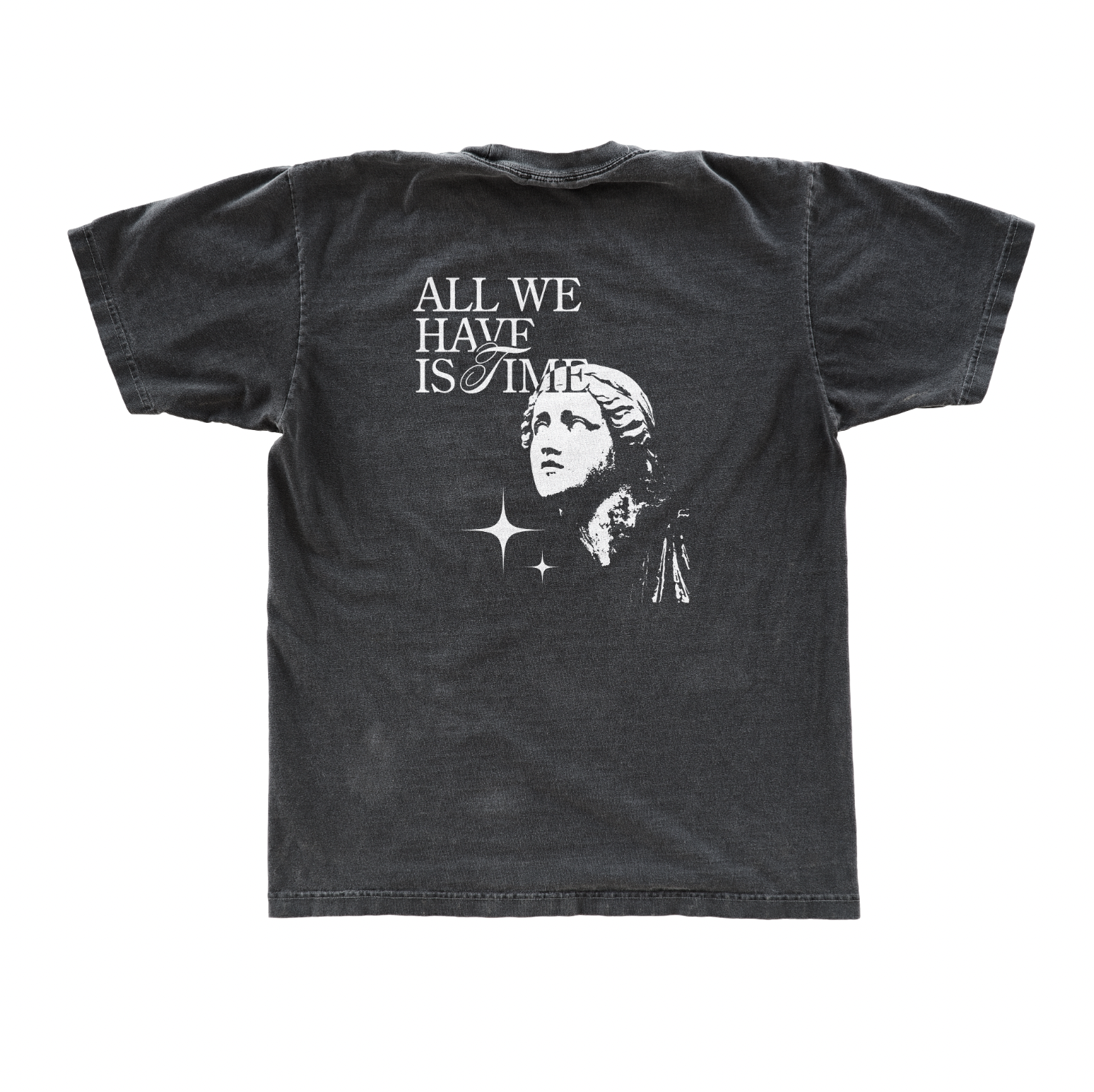
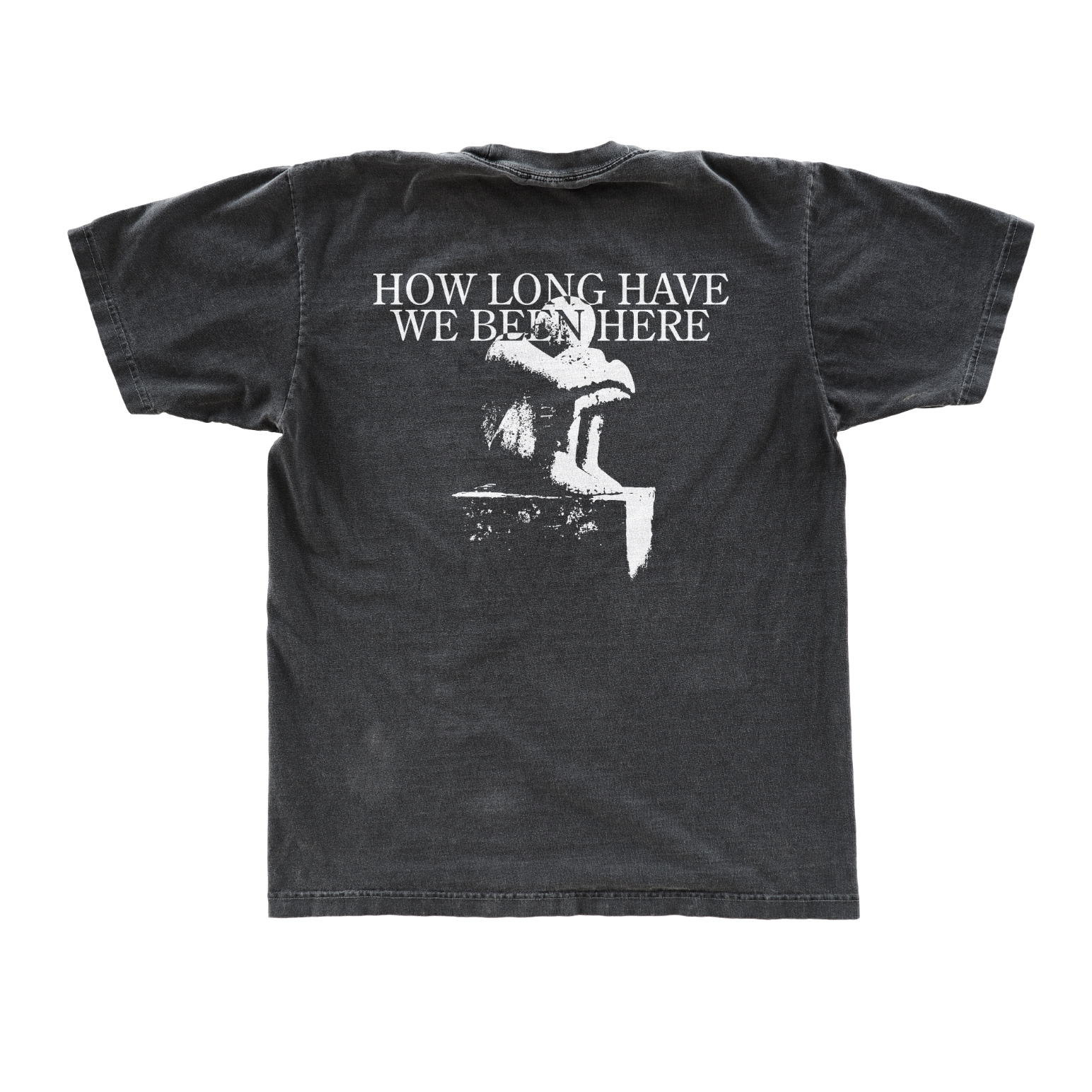
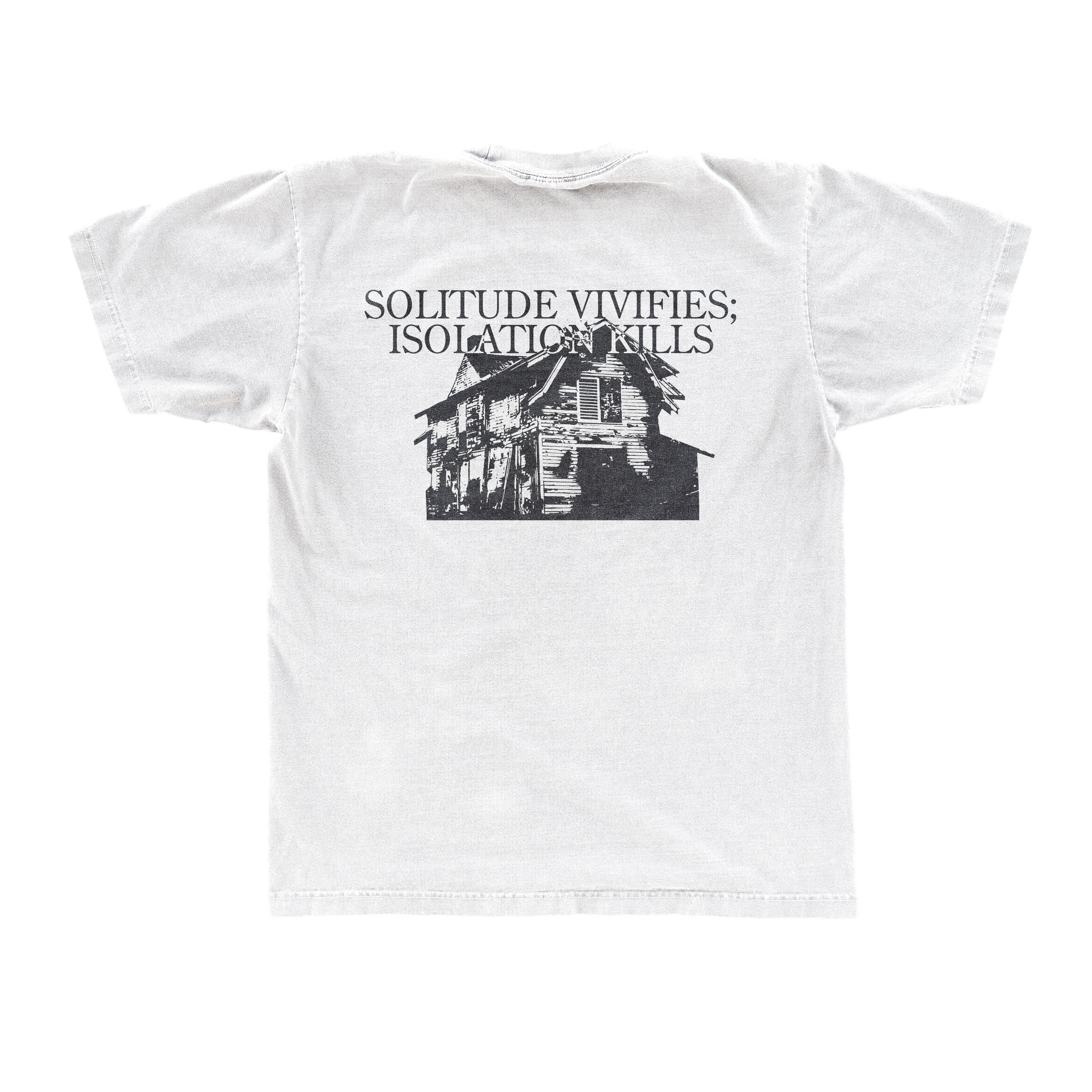
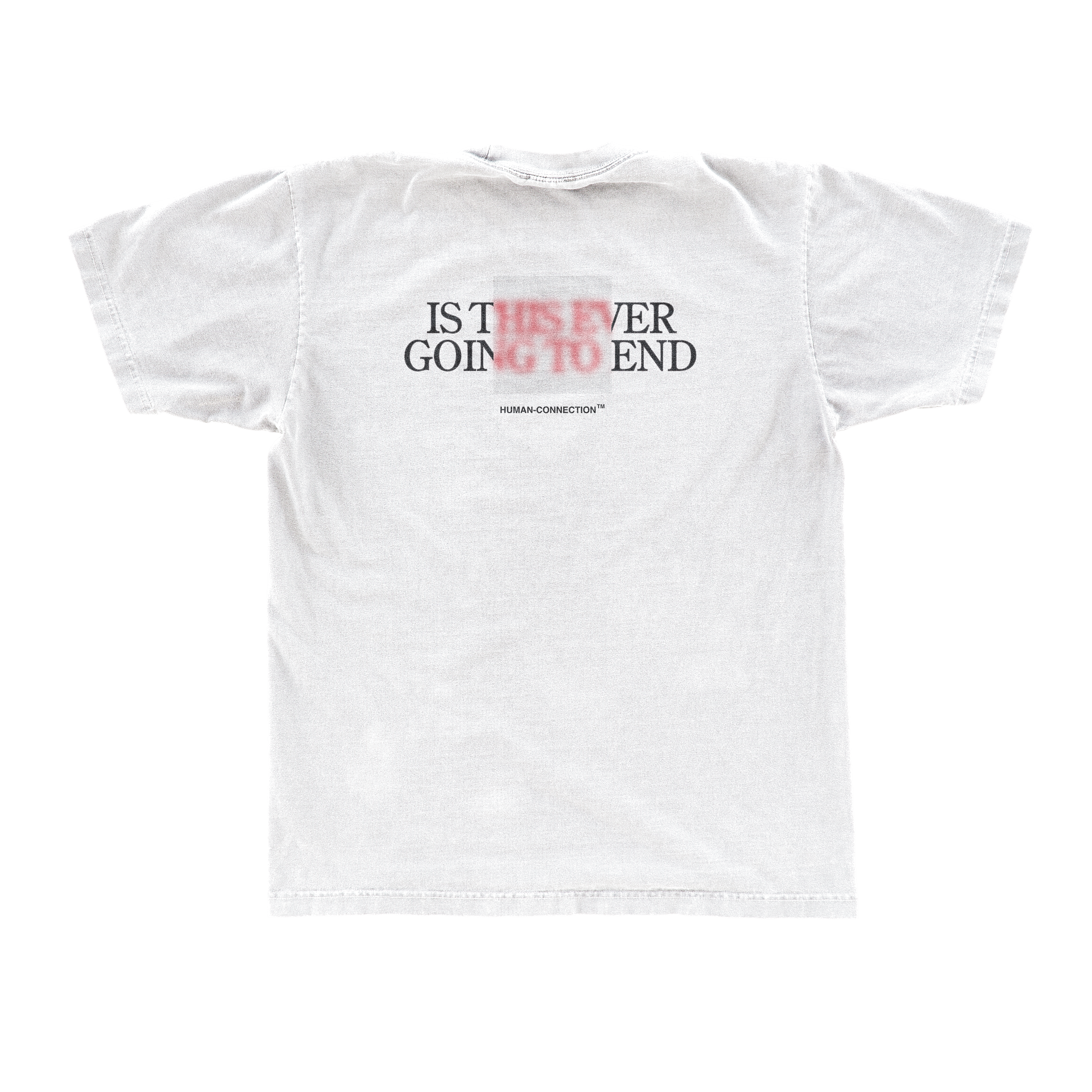
Work: Type design & Product design
Date: 2020
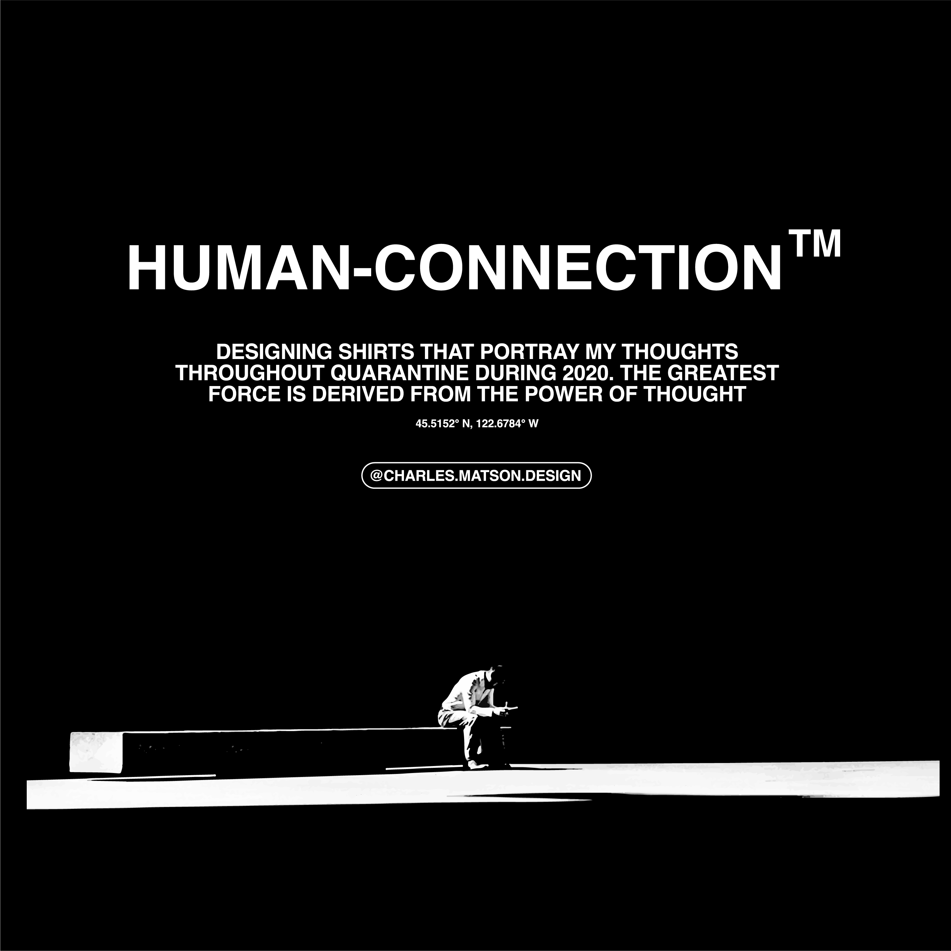
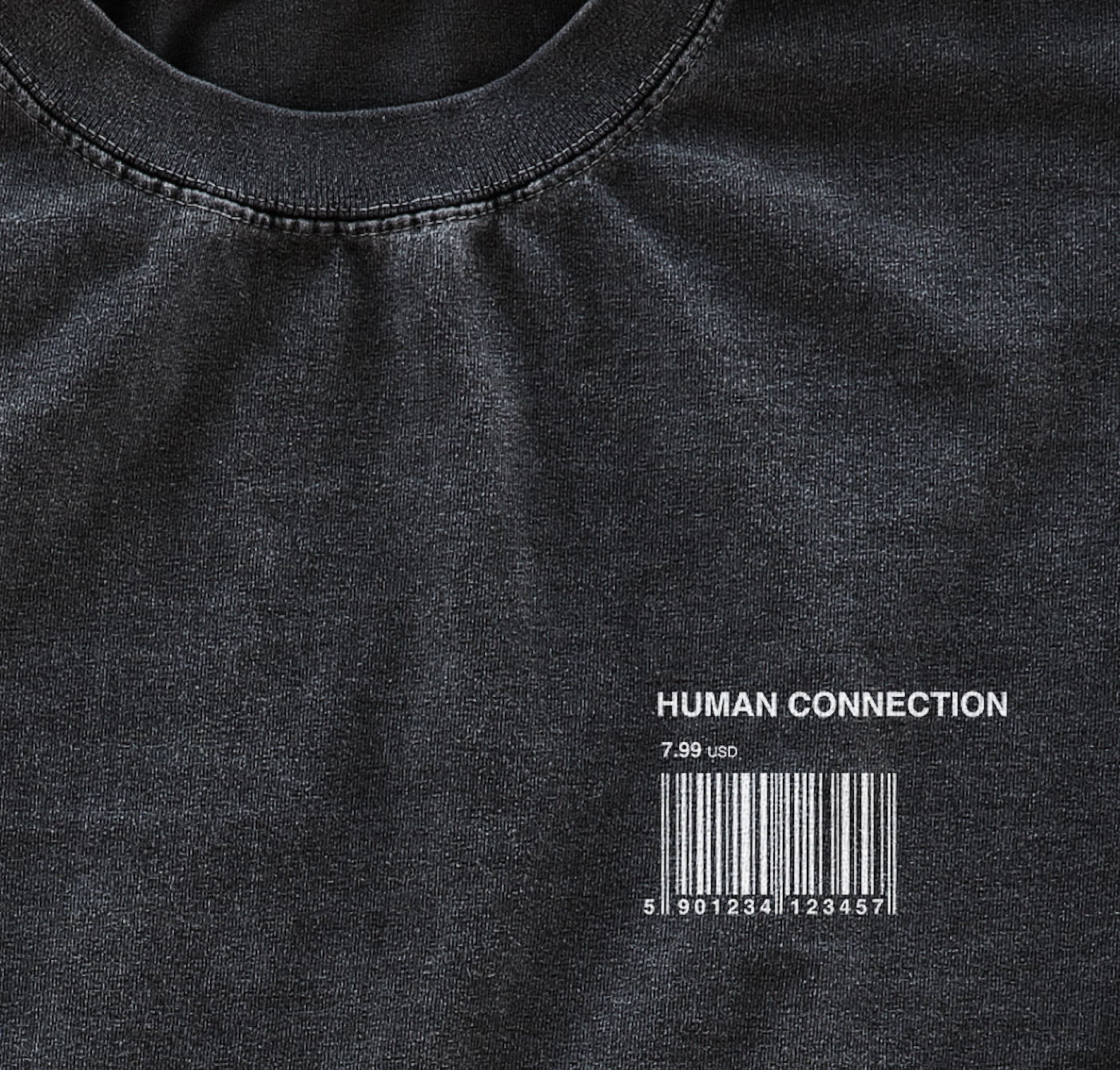
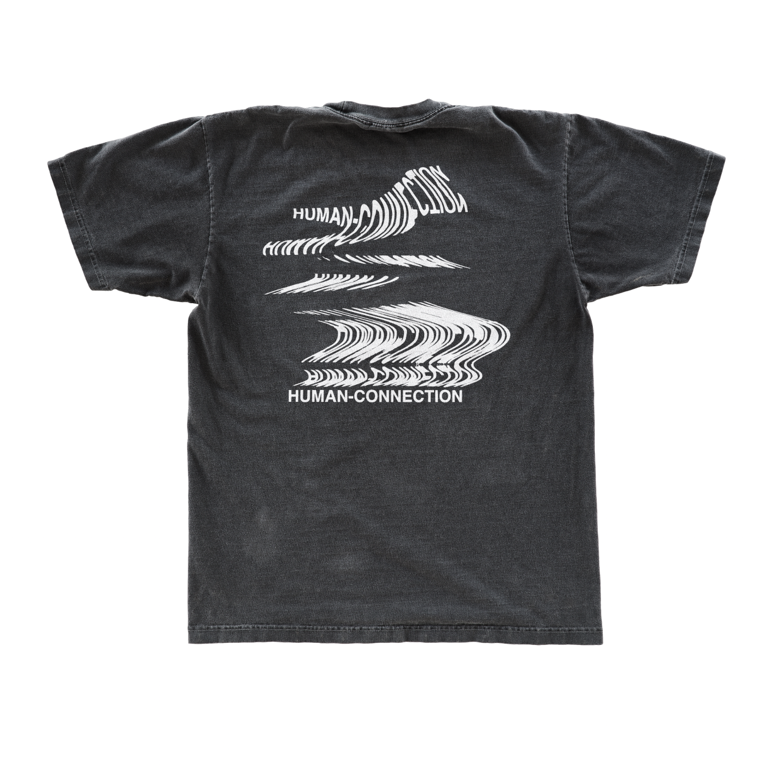
Details: Life changed for all of us in 2020 and we all had the longing for human connection. We were locked up for so long and a lot of us lost our passions and struggled with depression. I made this line of clothes focusing around the theme of quarantine and what feelings were brought from that. Human Connections focuses on portraying the more difficult thoughts that most of us felt during quarantine to show that we all are feeling like this. No one is alone in this strange world we are living in.
“The greatest force is derived from the power of thought.”


Work: Rebrand design, web design
Location: Portland Oregon
Date: 2020
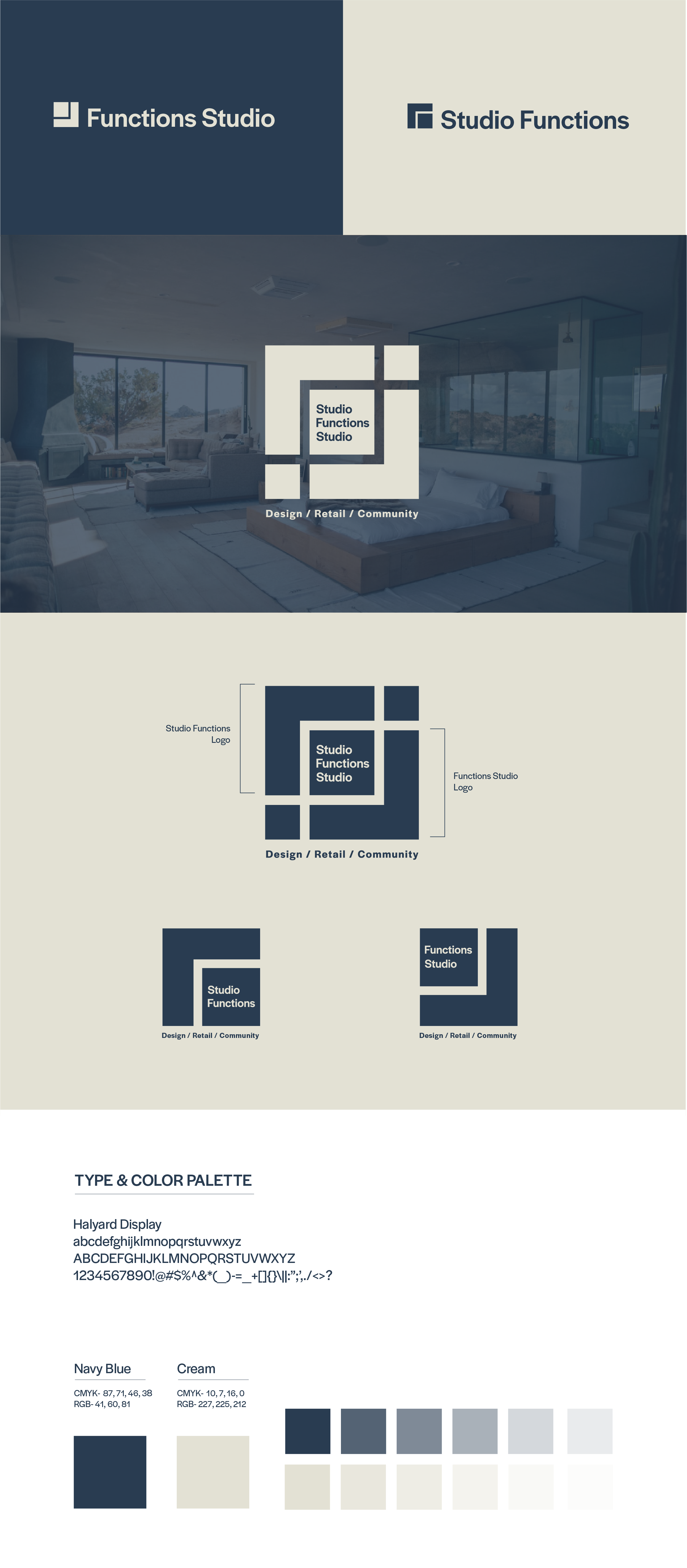
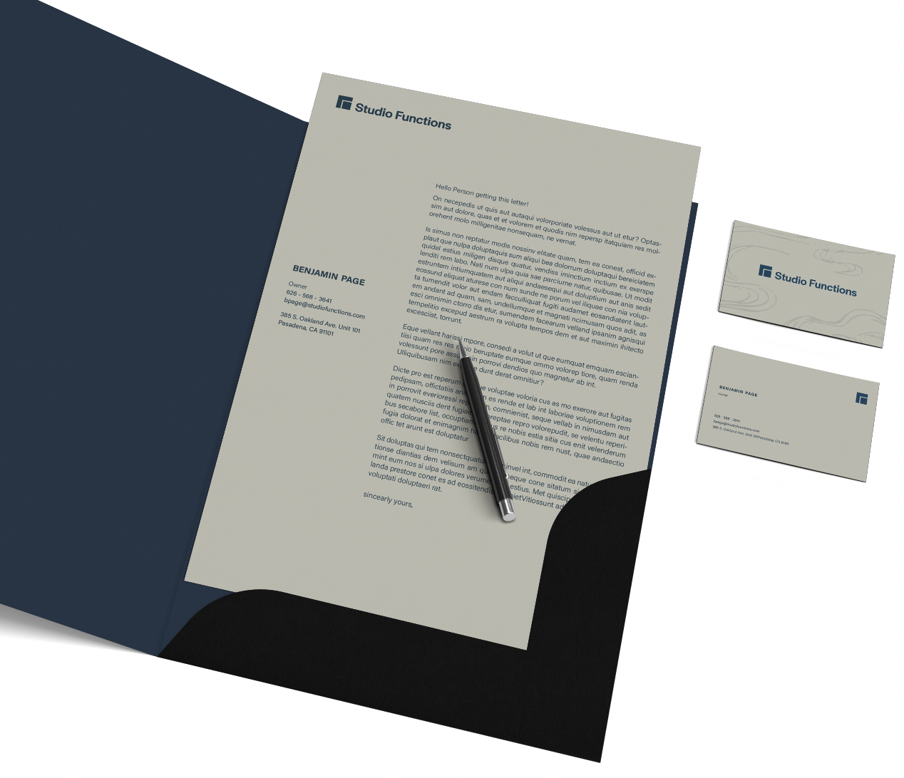
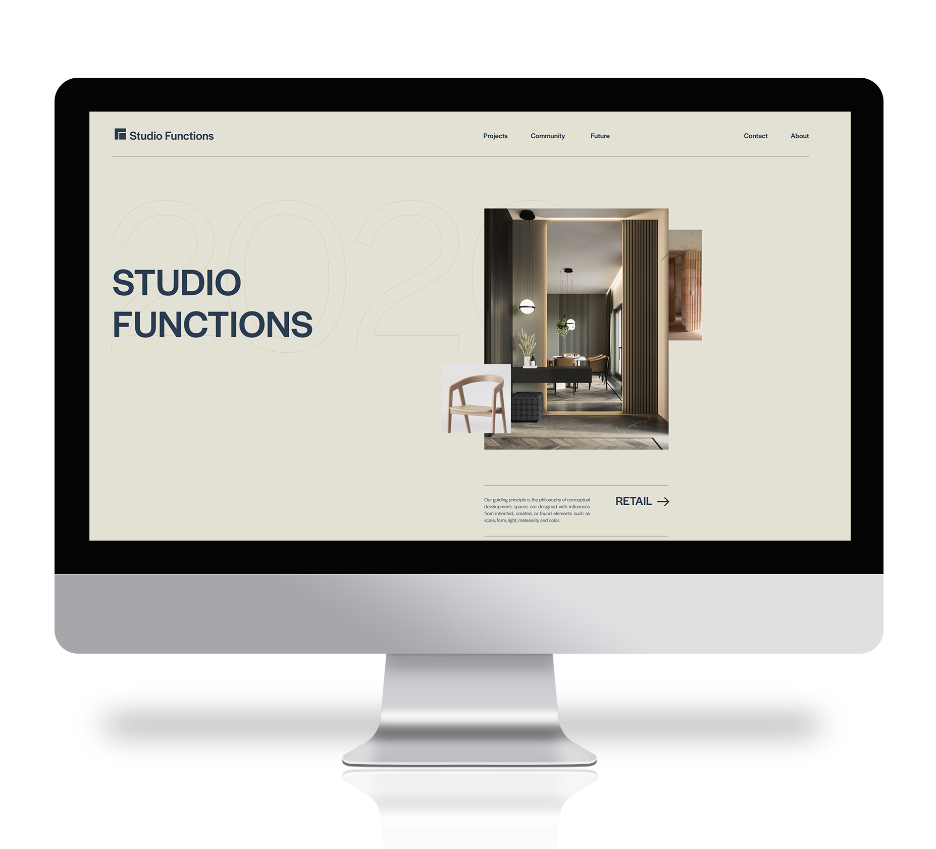
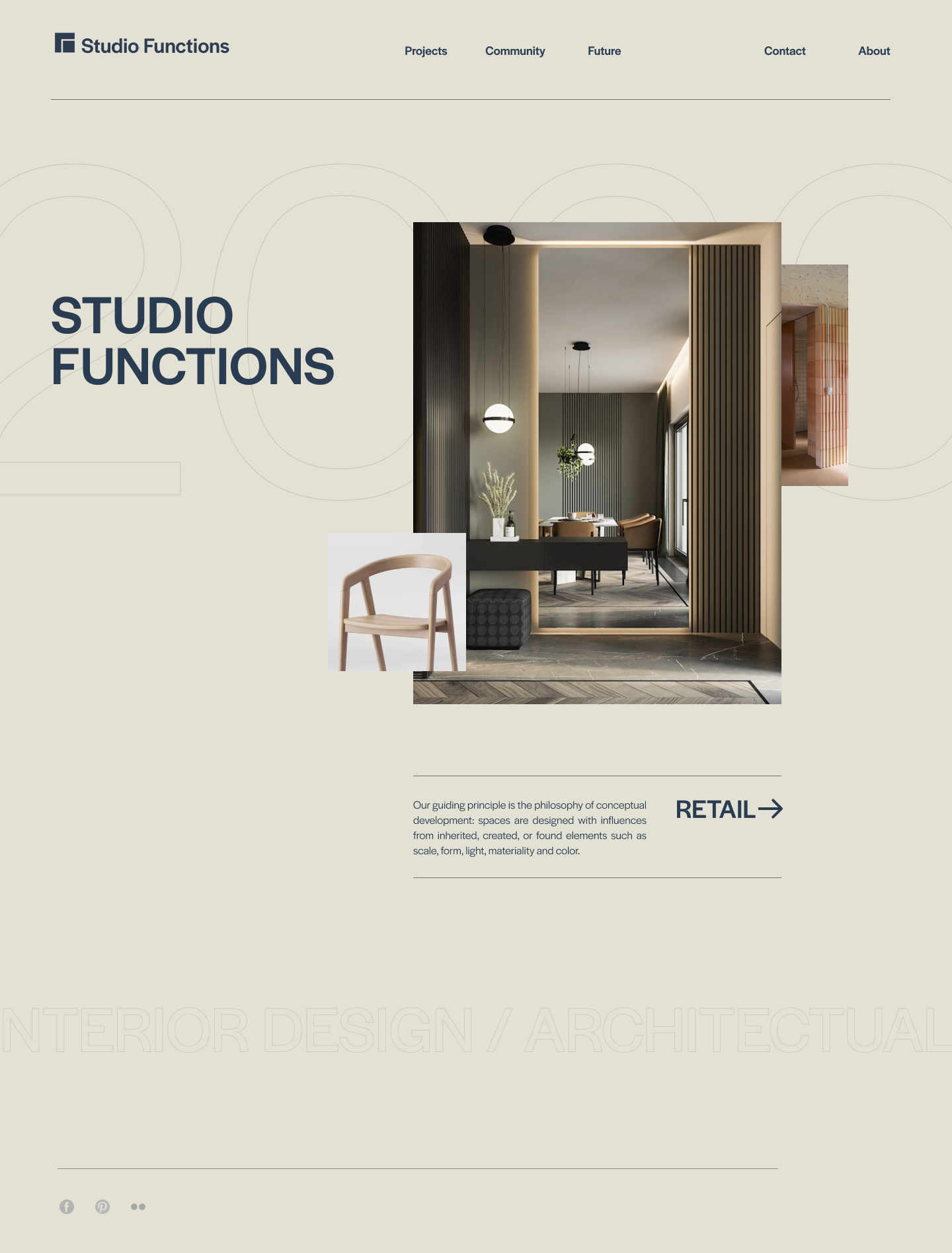
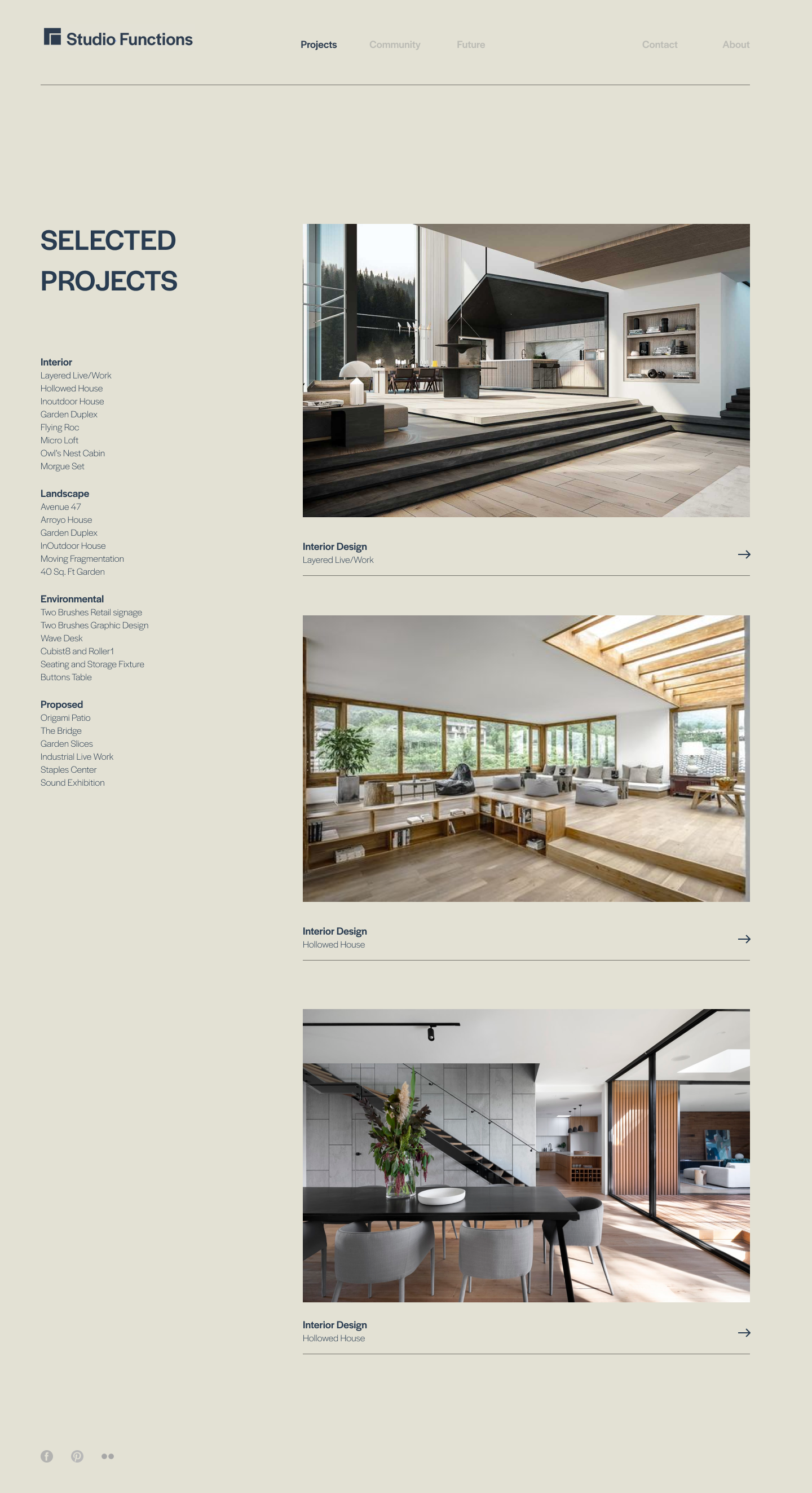
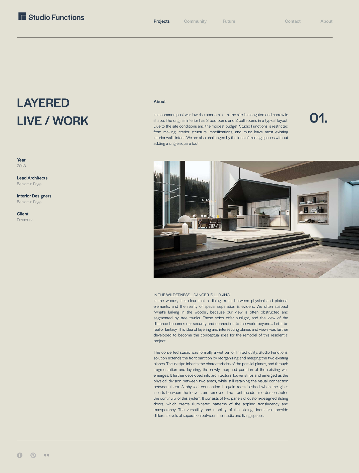
Details: Studio Functions Is a small interior design and architectural studio that needed a rebrand. They have two studios which are Studio Functions and Functions Studio. They wanted a complete rebrand and website design. For the logo they wanted something that could be used seperately but also goes well together.
Logo: My client had two companies, one called functions studio and the other, studio functions. He wanted two separate logos that could come together as one. This is an interior design and Architectural company which is the reason I wanted to use right angles and set structures incorporated through the logo. Putting each separate logo together makes the main logo for both.

Work: Typography and Page Layout
Date: 2018
Details: Expansive Planning is a magazine I designed focusing on my use of typography and layout. This issue highlights articles talking about ways that architecture can affect the way you think and I wanted that to show through my use of photos and how I laid them out.
Through my design I wanted to guide the reader's eyes in an effective way that focuses on the photography throughout and relaying back to the content of each spread. Architecture is a powerful form that affects the way we feel without us realizing it.
